What do I think absurd means?
I think that absurd is something that people wouldn't normally do. It could be funny, weird, fantastic and also strange. I also think that absurd can describe a very strange thing and what I find fascniating is when people do strange things with their photos.
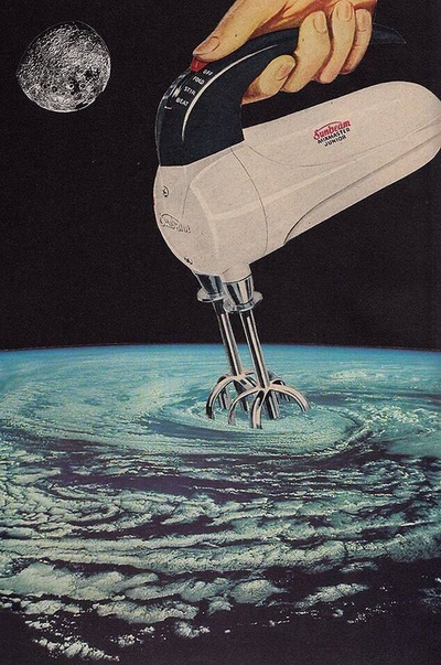
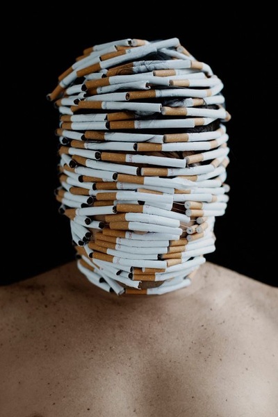
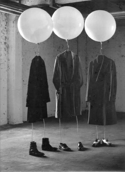
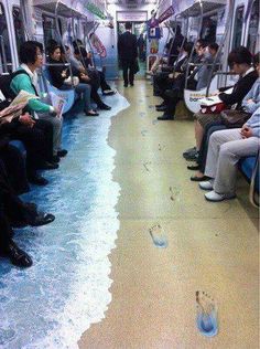
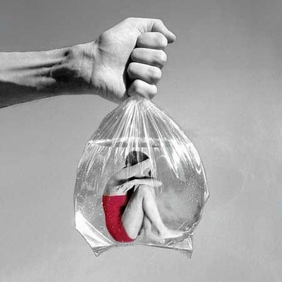
I got these images from pintrest and I personally think they are interesting because whilst they are very strange, the photo itself looks amazing. The reason I say that is because they are actually absurd and they get my attention very well. I then start to think, Why is the photo like this?'. I also try to figure out how it has been created and what the photographer did to the photo and what he/she used to make the photo become like this.
Mina Sarenac
|
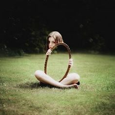
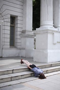
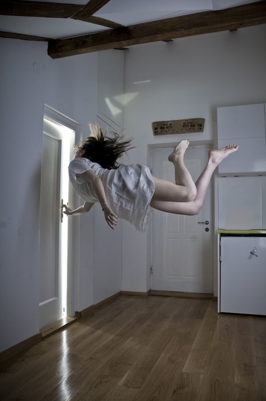
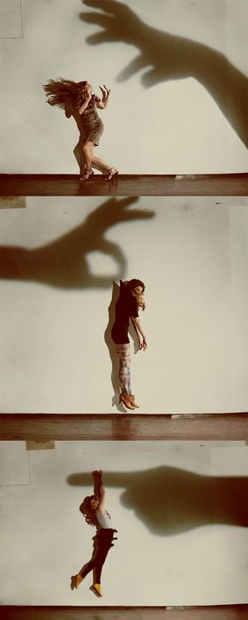
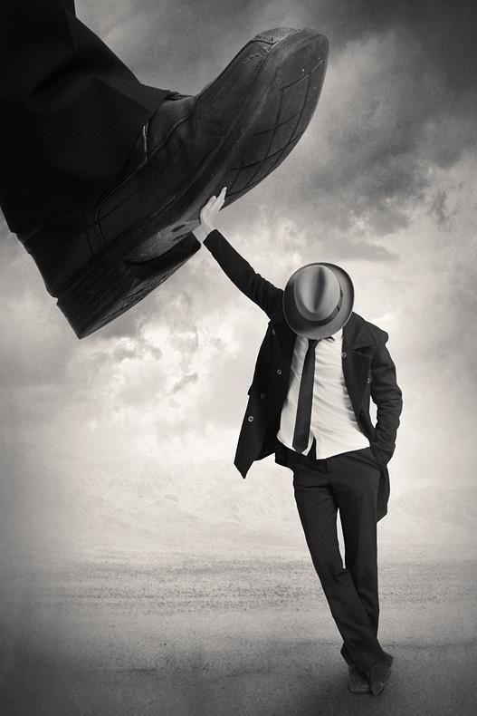
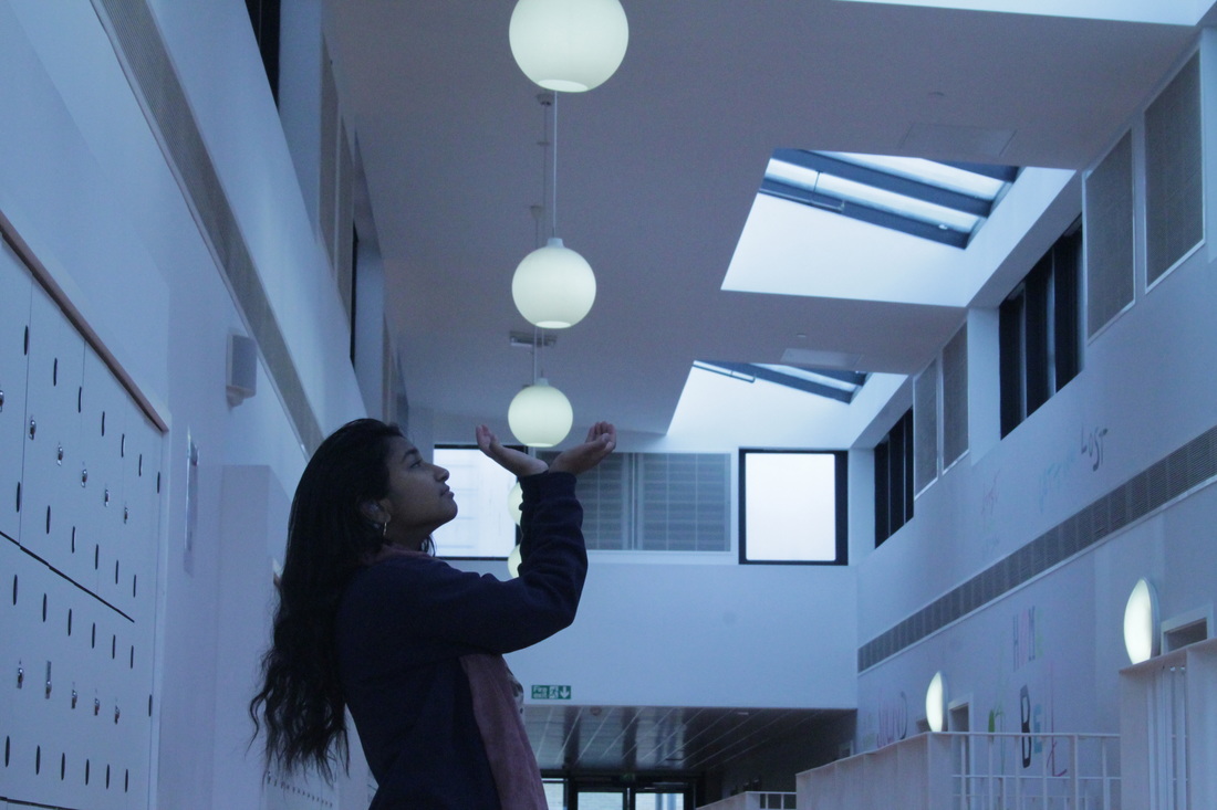
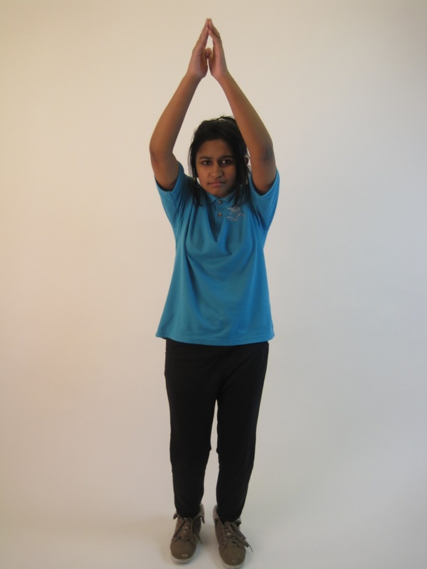
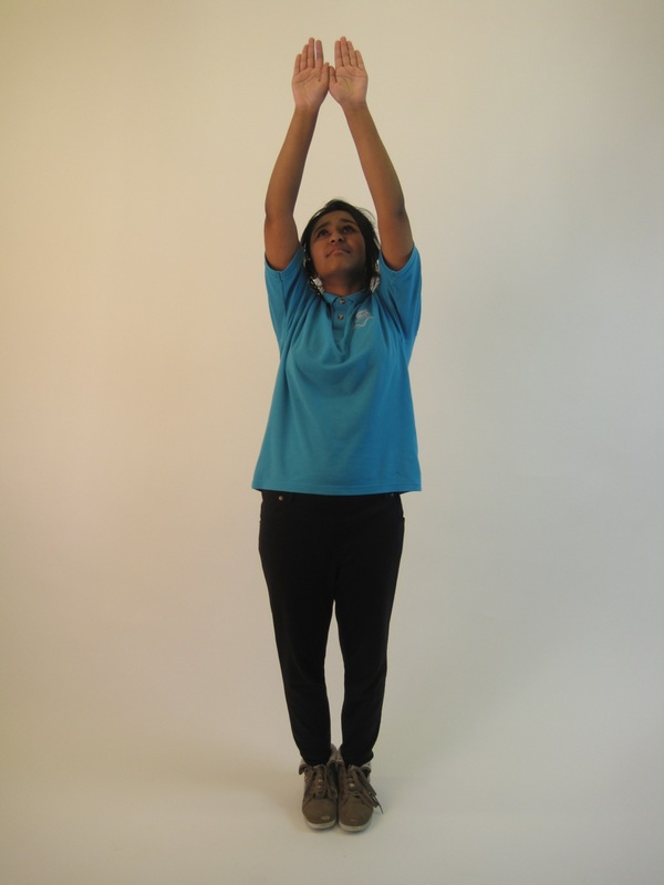
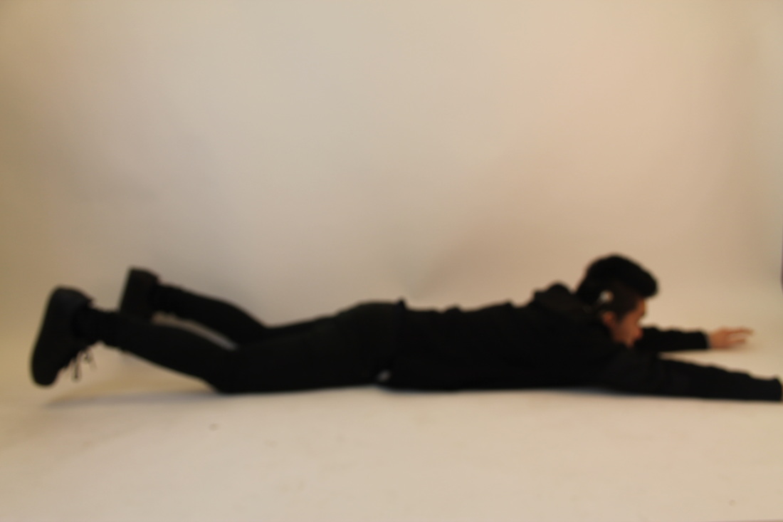
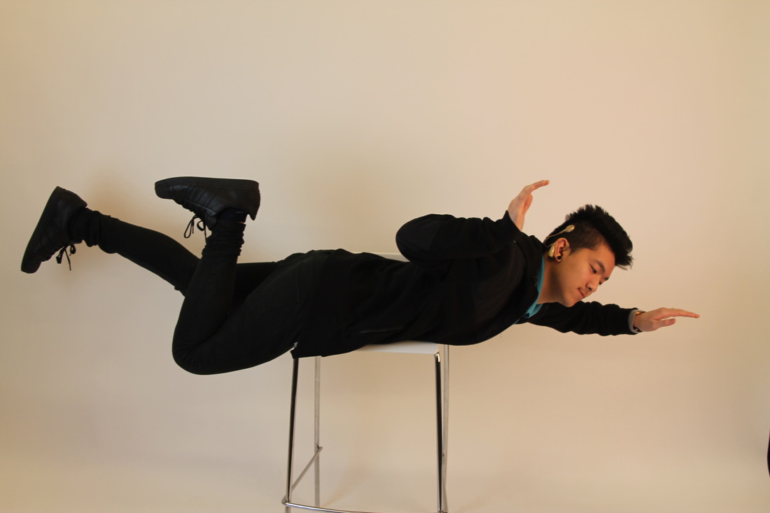
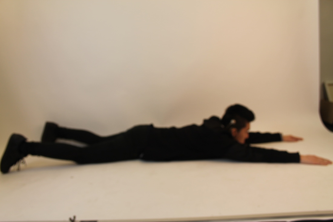
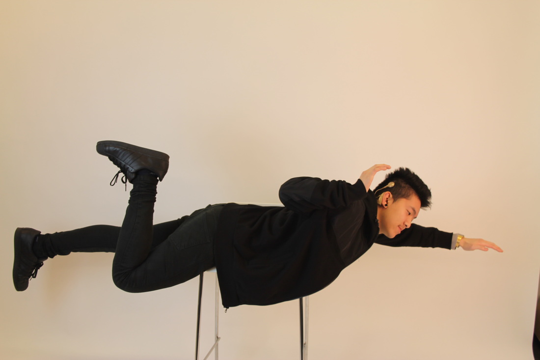
I picked this picture because its a photo that I have never seen before and it also looks very different and interesting and I was thinking about how Mina created this photo and how she made it look like she was up in the air. So I am thinking how I could create a photo like this.
The photo also looks very strange. The woman's dress is light and floaty, and her hair is flung upwards towards the ceiling. As she opens to door, it looks like there's something exciting and bright on the other side. I like the way the lady is floating up and it got me thinking about how to do this. I think I will do something similar to this for my final piece. |
|
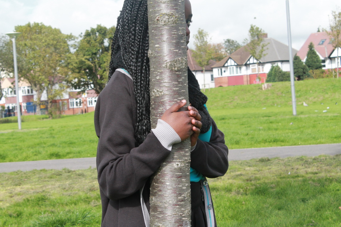
Activity #2 Hide
|
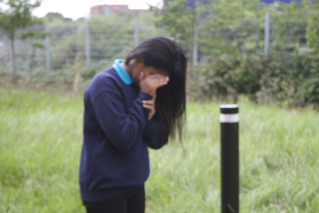
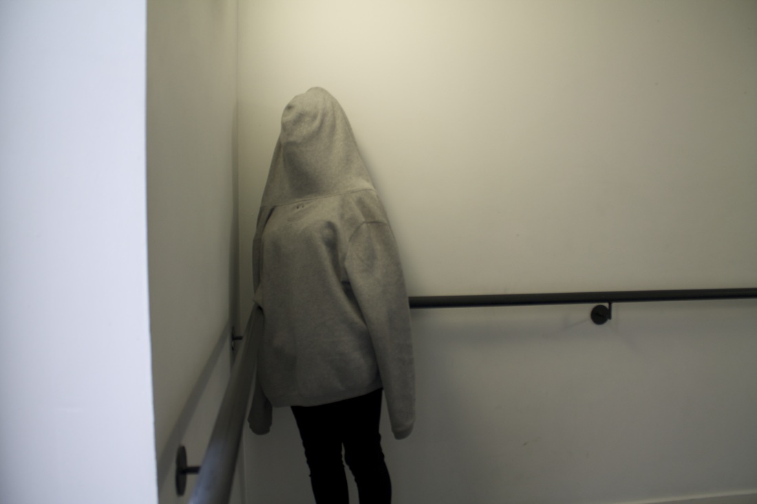
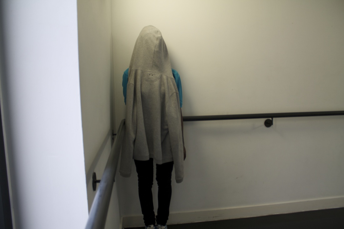
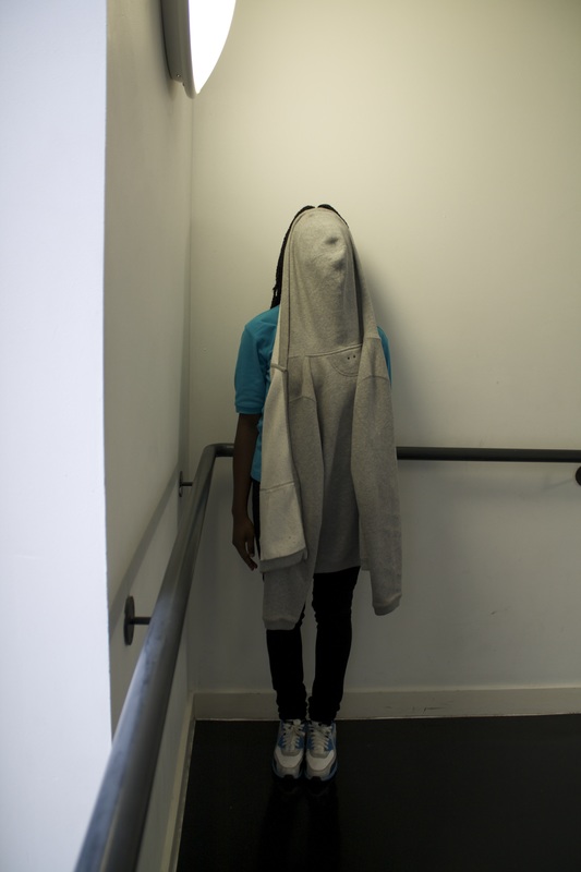
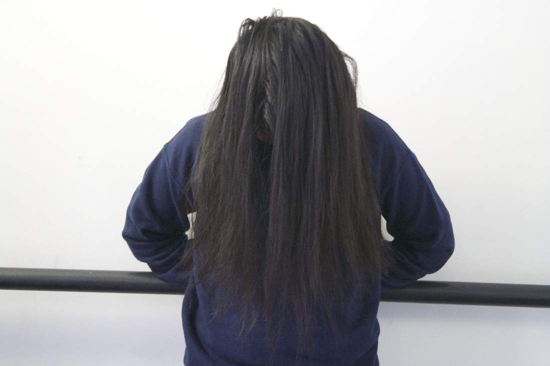
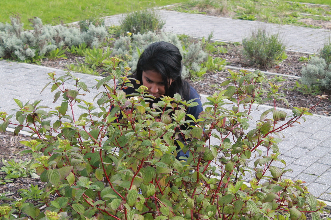
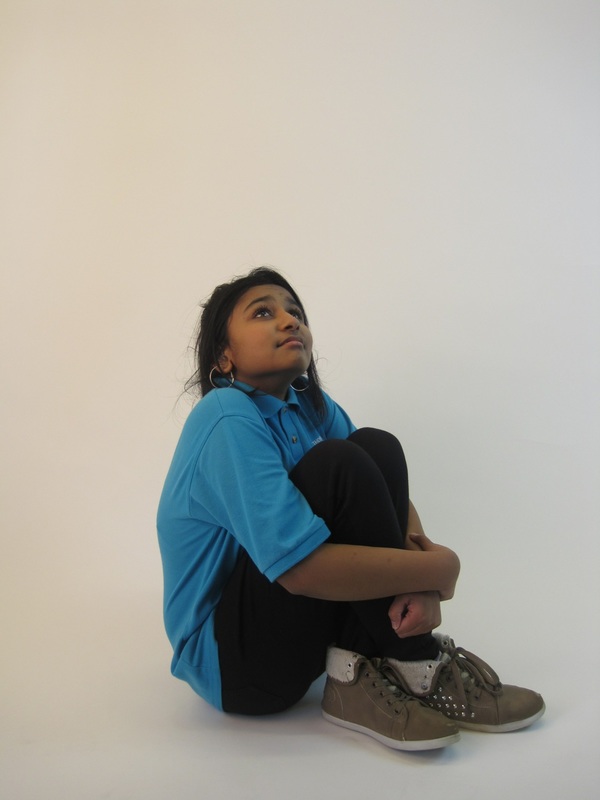
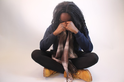
I wanted to create photos of people hiding. I started by hiding behind my grey jumper but when I looked at the photos I found them to be a bit simple and not as effective as I would have liked. Next time, I will add extra things onto the jumper, e.g glasses, to make my photos look more effective.
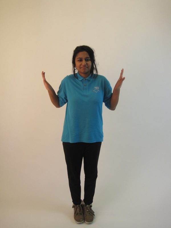
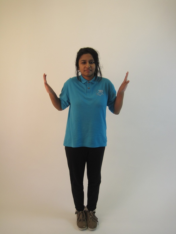
To start with, I was thinking about where to hide, and I thought maybe my jumper would be a good idea. I had seen a similar idea on Pinterest when I was looking at other photos. I didn't use any equipment in the photo, but next time I would include some objects. I don't think that any of these images worked well because it looks very simple. Other people's view about theses photo is that they're not quite absurd; they're only hiding, so maybe for next time I could think about how to combine 'absurd and hiding' at the same time. If I was to do another photo shoot using the 'hide, and absurd' themes, I think what I would do differently to get a better result is to take maybe a photo with a white/black background cover and maybe edit it. Other ideas that I have for the 'absurd' project overall is taking photos in strange places. |
|
'hiding' evaluation
|
These are the photos that I took a few days ago and this is how I thought I could improve my photos from the other photo that I took before.
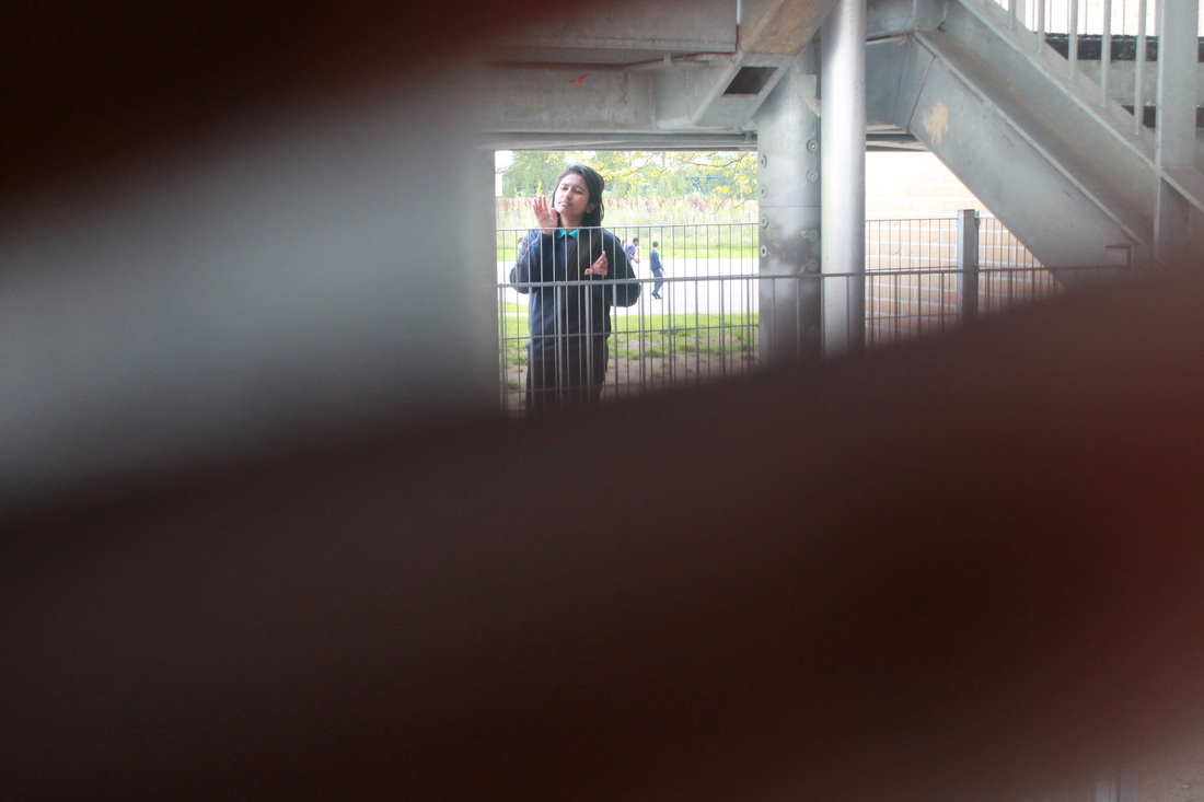
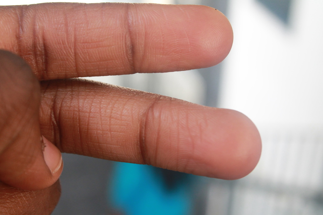
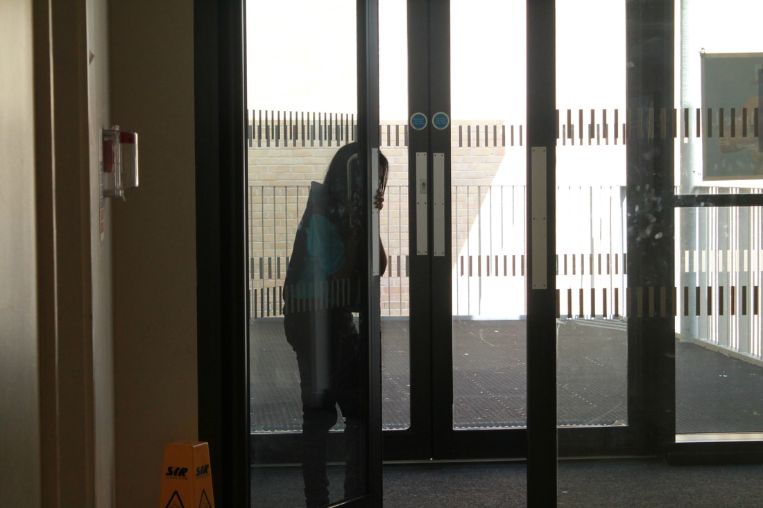
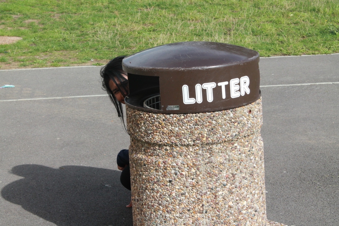
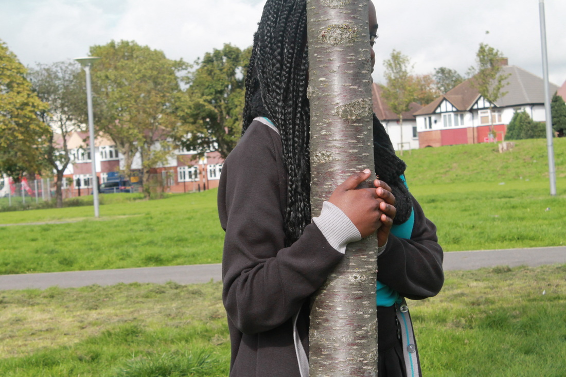
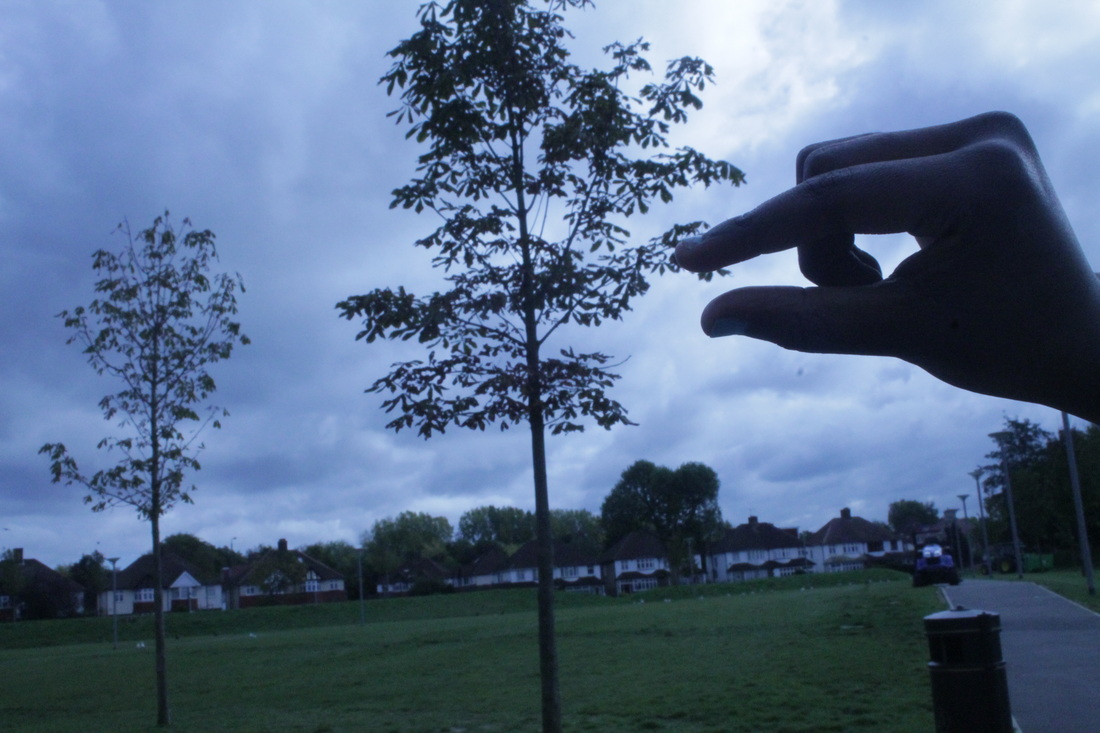
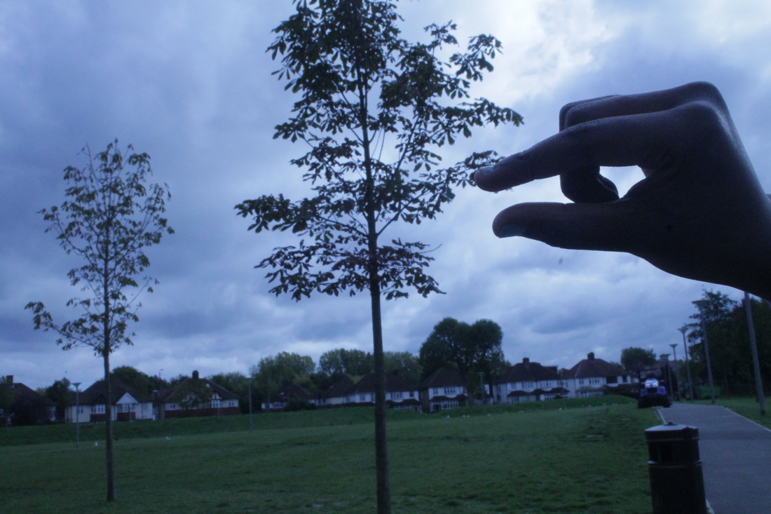
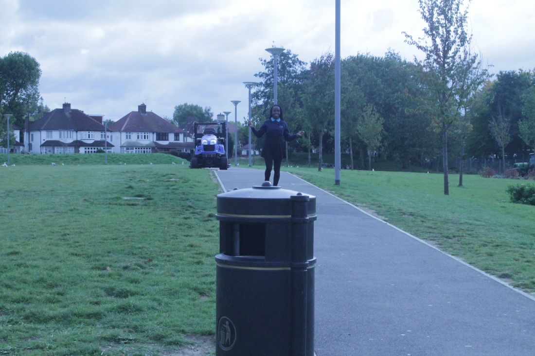
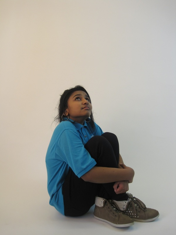
My first idea was to take a photo behind the bin and this gave me the idea of hiding behind other things. I didn't use any equipment for these 'hiding' pictures that I took, I just hid in different places. But I got a little bit board of hiding behind different things and thought, 'Maybe I can make it a little bit more effective.' So, I decided to get a person to stand behind something then I used my two fingers to make it look a bit more like 'hide' because you couldn't see the person's whole body. I asked someone what they thought about the pictures and they particularly liked the one where the girl is hiding behind the door because of the etching on the glass. They also liked the first photo because the person is standing far away and you can't really see everything. Overall, I think the photos look good. |
|

|
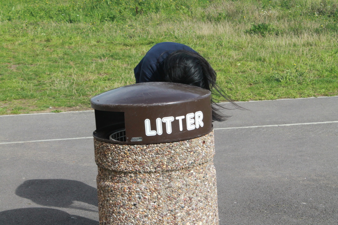
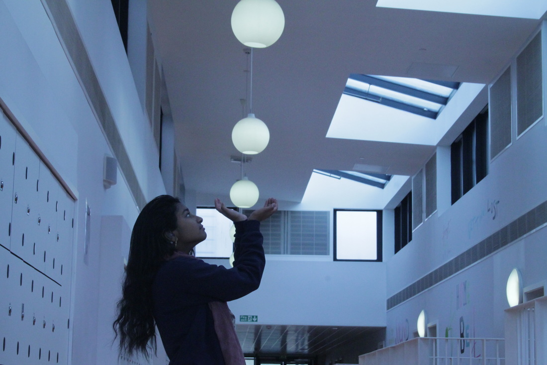
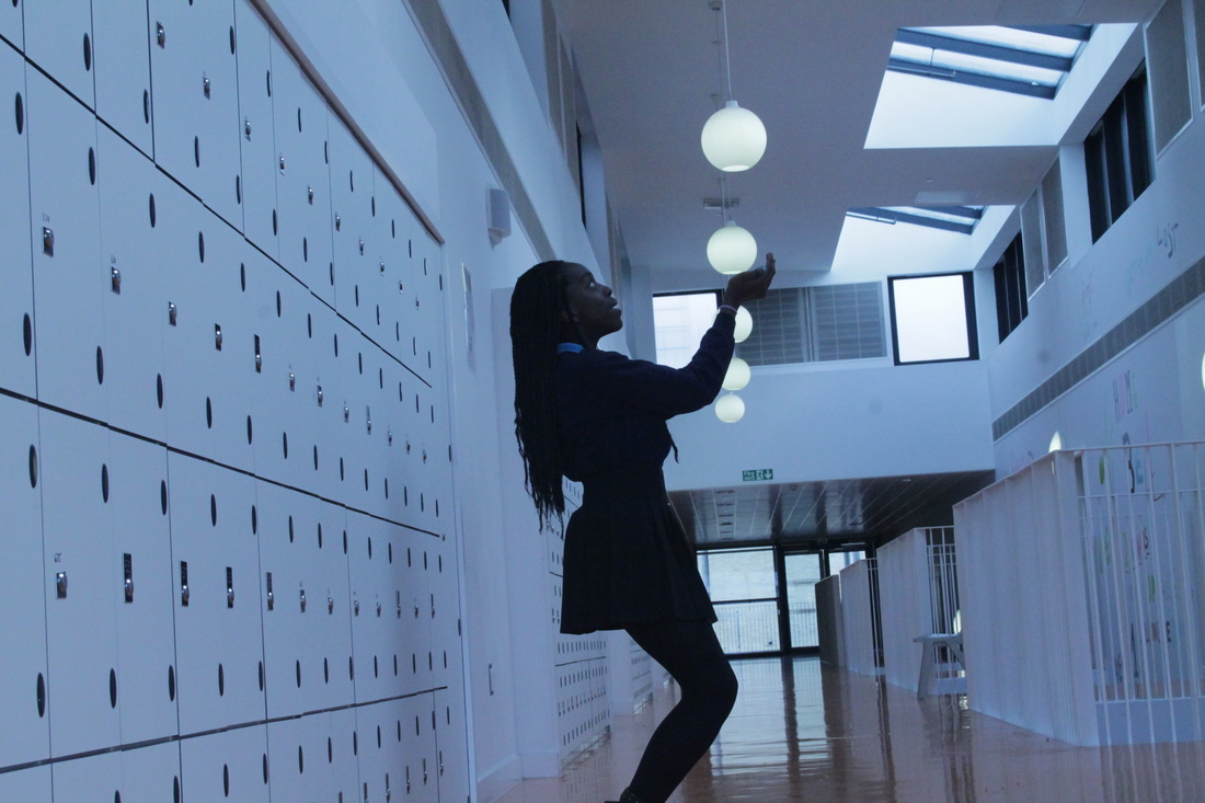
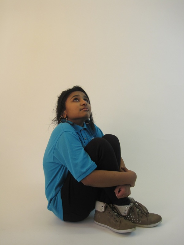
I think that these images worked well because they look more interesting then the other photos.
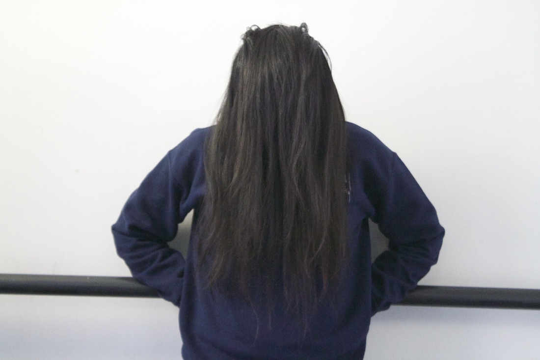
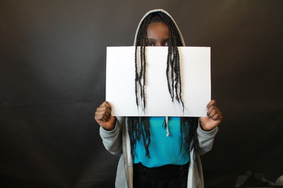
In this first photo you can't really see the person fully, and it's interesting because she is standing behind my finger and this was a new idea that I came up with and hadn't thought about before. The 2nd photo, below, is even more interesting because it shows a different type of 'hide'. You can't see my face because I am hiding behind a white board and infront of a black screen. This photo was taken by someone else . |

|
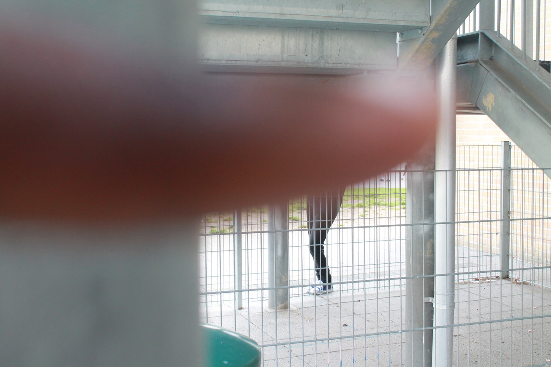
Final Image

I have chosen this as my final image because, it looks better. I like the way the white cardboard is covering most of my face and you can see my eyes and some of my hair but not all of it. I also think that it's a good photo because of the effect that is on the photo, it makes it look good.
Activity #3 sign
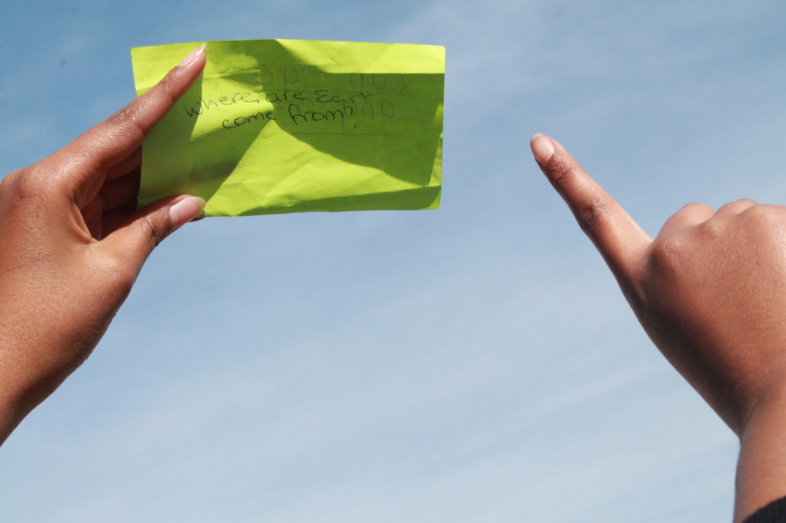
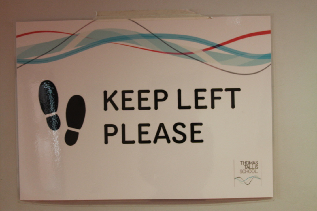
Normally a sign is what helps us know what something is talking about, it can be rules or directions.
I have seen some photographers using signs in a weird, funny and opposite way.
I have seen some photographers using signs in a weird, funny and opposite way.
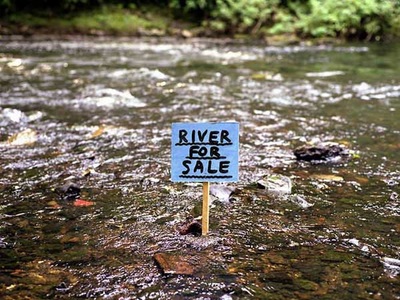
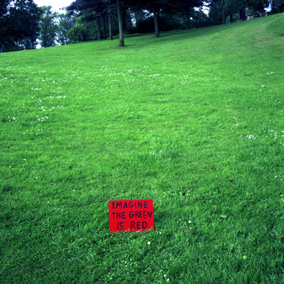
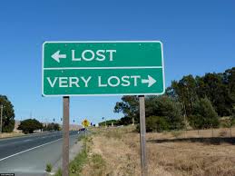
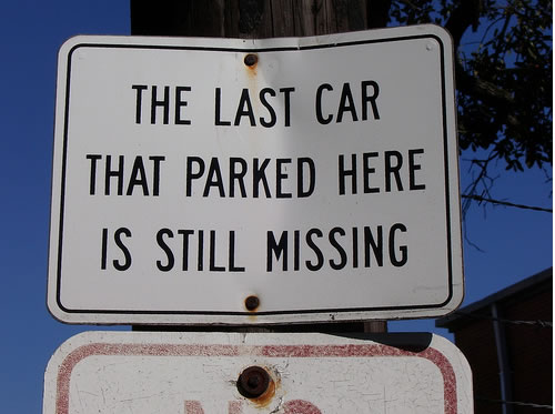
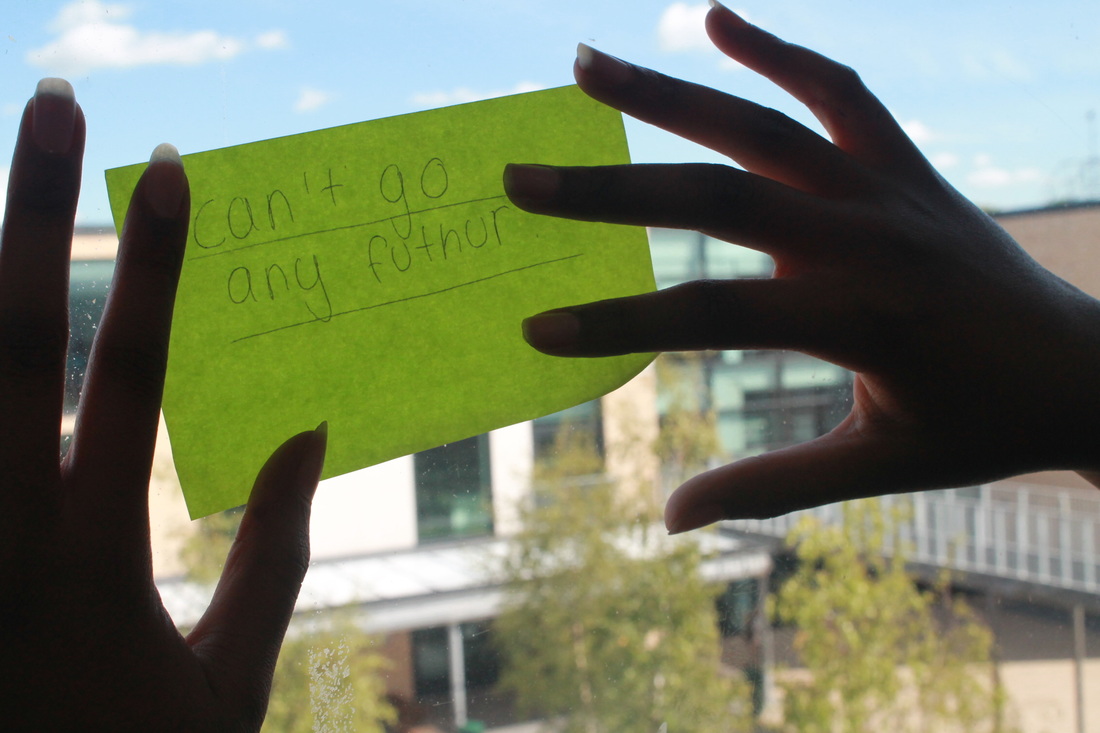
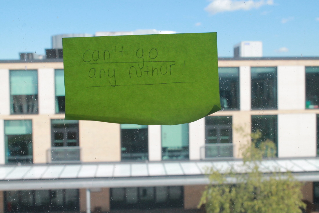
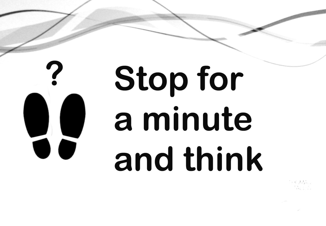
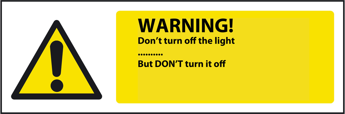
I think that these photos look absurd because they're written in a confusing way. They're very distracting and grabs people's attention very well. They get people to focus on the photo because they are trying to work out what it means themselves.
When I look at these photos, I start to get confused and my brain tries to figure out what it really means. Then, when I look at the photo properly, I get what it's trying to say. I personally think that these signs are quiet funny in a way - but not very helpful because it confuses people's minds.
The reason I think the artist has placed these signs in theses place is to make people think about why it's there and they want to make people laugh. I think that these signs are aimed at people who look at posters the most or even signs.
The reason it's important to take photographs of signs is to make people aware of whats going to happen soon and they are good because they direct people the right way.
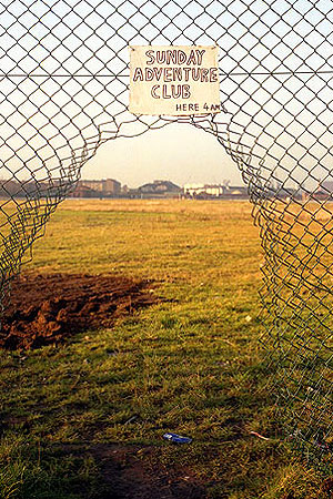
David Shrigley
|
David was born on 17th September 1968, in Macclesfield in England and his family moved to Leicestershire 2 years later. He studied at Glasgow School of Arts from 1988 to 1991 and he still lives and works in Glasgow.
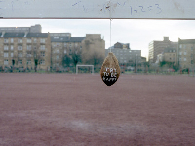
What I find interesting about this image is the sign and where it has been placed. It's also very strange. The place that the picture has been taken in is very big, it looks suitable for the photo. When I read 'Sunday adventure clubs', it kind of gives me an idea of how David is trying to link it with the photo, because when they enter a club they enter a door, so there's a fence that's open so it makes sense and that's how I think David tried to link the two parts of the photo together. |
These are the ideas that I came up with.

These are the images that I came up with to put in different places. I think that 'hide' is one of the hardest topics compared to others that I have been doing. You have to think of what to say on the poster; it can be very challenging sometimes for me, because I know that it has to link in a way and I personally think the aim of this type of sign is to make people confused and think about what it really means.
Evaluation
Overall, I think that these signs are good. They give an idea to people of what you're talking about but it also confuses them. I also like the fact that I have came up with a few ideas of my own. Next time, if I could, I would take more photos and make them in photoshop as they would be even better I could make them look realistic.
Evaluation
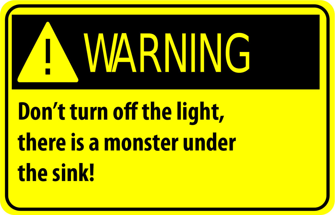
These are the new signs that I have come up with and I have taken the first one from the building in school an dI decided to edit them in photoshop and come up with something else to say, but I have also changed the colour to black and white to make the whiteness more better, but I didn't place it anywhere. I have also done another one that I took of from the internet and change the warning in photoshop and it took me a while to think of what to say on that sign.
activity#4 forced prespective
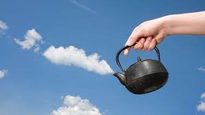
I got these images from pinterest and I think I like the idea of forced perspective, the way the photos are flattened and also blended in together to make it look at if it's one photo when really its 2-in-1.
I am planning on making more of my own forced perspective photos because I know that I will come up with lots of different ideas from this topic.
I am planning on making more of my own forced perspective photos because I know that I will come up with lots of different ideas from this topic.
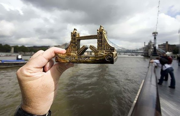
Michael Hughes
|
Hughes was born in Kingston, London, on 18th May 1952. He started photography in 1973 using his dad's camera, went to evening classes in 1974 and 1975 and became a professional photographer in 1981.
What I find interesting about this image is how well its been flattened together. You can't really tell the difference between the boat and the bridge, because of how flattened it is. I think that this photo is very cleverly presented because it goes together well. |
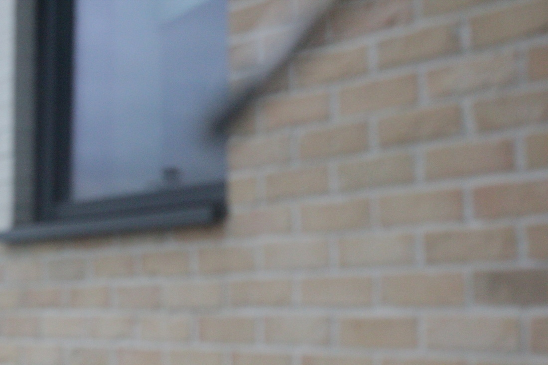
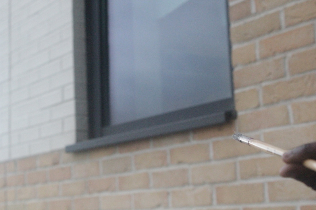
I took these images and tried to make it look like I was painting the bottom of the window sill. The I got this done was I got a volunteer and she held the paint brush and I told her how to hold it for me properly, but I think this didn't work out very well so I think for next time I will do a different type of forced perspective Image.
I got this Idea from one of my friends and I thought that I would try it out to see if it would really work but eventually I realise that it didn't work out for me .
I got this Idea from one of my friends and I thought that I would try it out to see if it would really work but eventually I realise that it didn't work out for me .

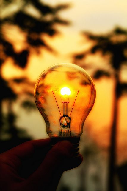
I have taken varieties of images from forced perspective, this is what I have started of with, and this is interesting to me because I never thought that I would come up with these types of photo's. The type of photo's that I think worked well was the ones that look like 'am holding light bulb' because it looks real and different from the other photo's that I have taken, how that photo was done was I got one girl to stand in front of the light bulb but far away from the light bulb to make it look like she was holding it.
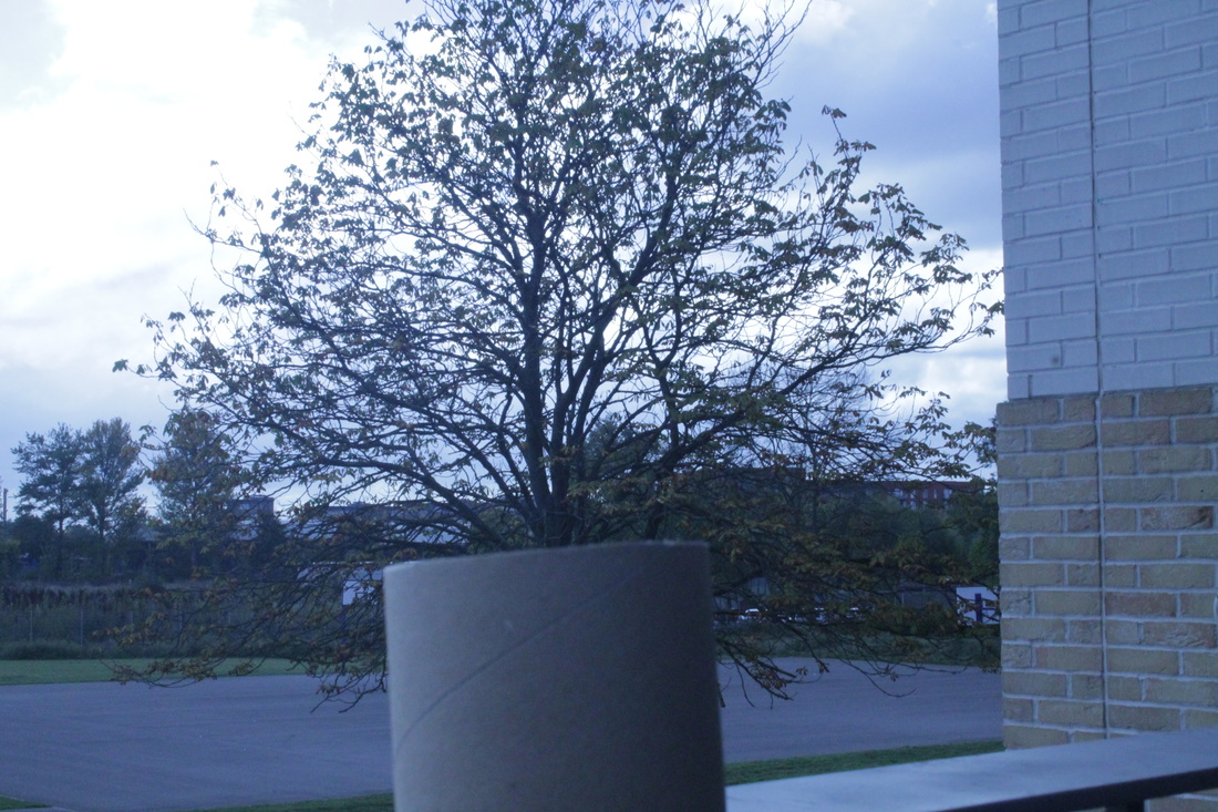
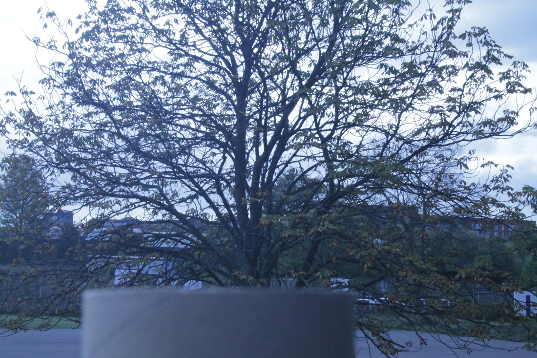
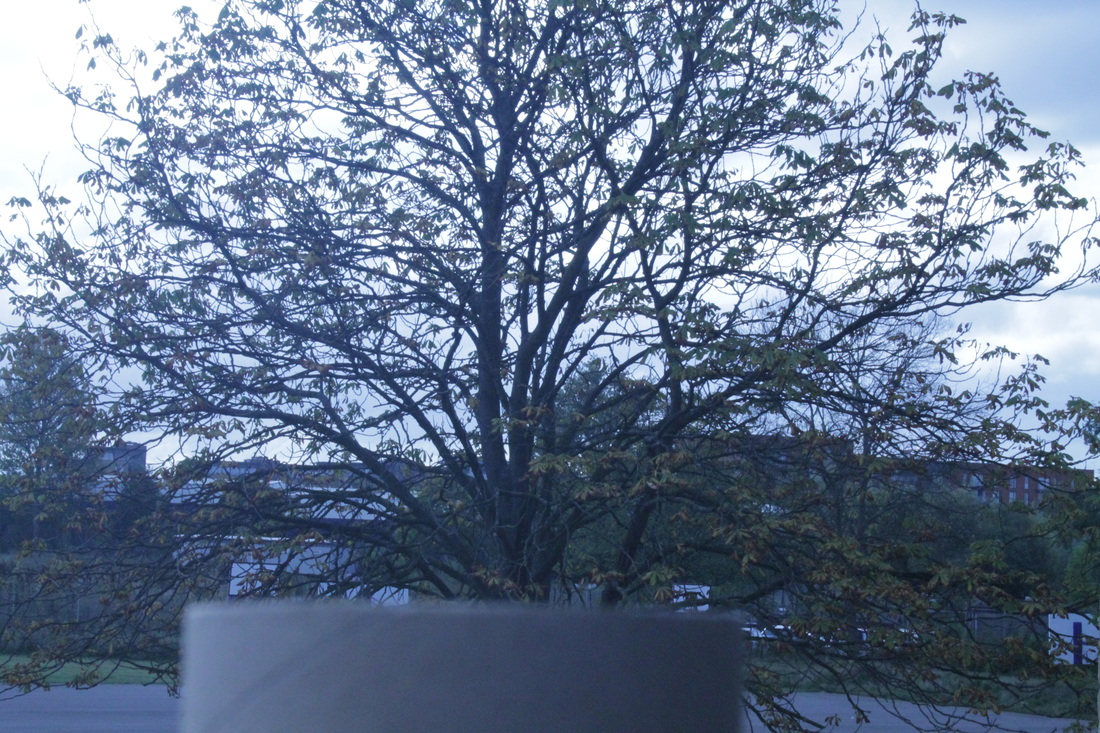
The photo's that I think didn't work well was the 'tree' because it doesn't look to much of a forced perspective, and how I think that photo could improve is maybe I should get a different object instead of using the tissue roll, to make it look more interesting and better.
The photo's that I think didn't work well was the 'tree' because it doesn't look to much of a forced perspective, and how I think that photo could improve is maybe I should get a different object instead of using the tissue roll, to make it look more interesting and better.
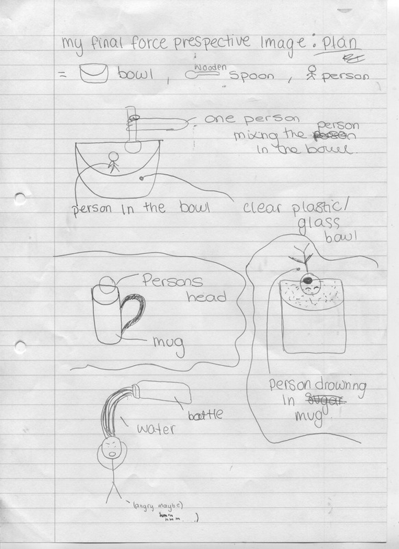
My plan for final force prospective image
|
This is my final image plan with ideas that I came up with and that I am aiming to get done. Hopefully, it will come out exactly how I want it to.
I had about 4 ideas linked to forced perspective. Firstly, I have came up with the idea of having a person in a bowl and another person's hand looking like they are mixing the other person in, just as if they where baking a cake or something. Then I would go on photoshop and edit it. Secondly, I had the idea of having a clear mug with a person's head just at the top of it. Thirdly, I thought of maybe using a jar and a person looking like they were about to fall in the jar. I would do this by getting the person to stand or pose like they are jumping or about to fall into something, then in photoshop I would turn it upside down to make it look real. My fourth idea was to get a person to look shocked and to cover their ears or head with their hands. Then, I would go on photoshop and make it look like it was raining heavily or that lots of water was pouring on their head. |
Final image #1&2
Photo Shoot
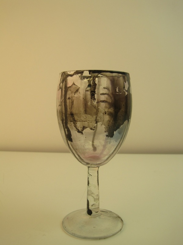

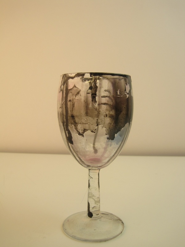
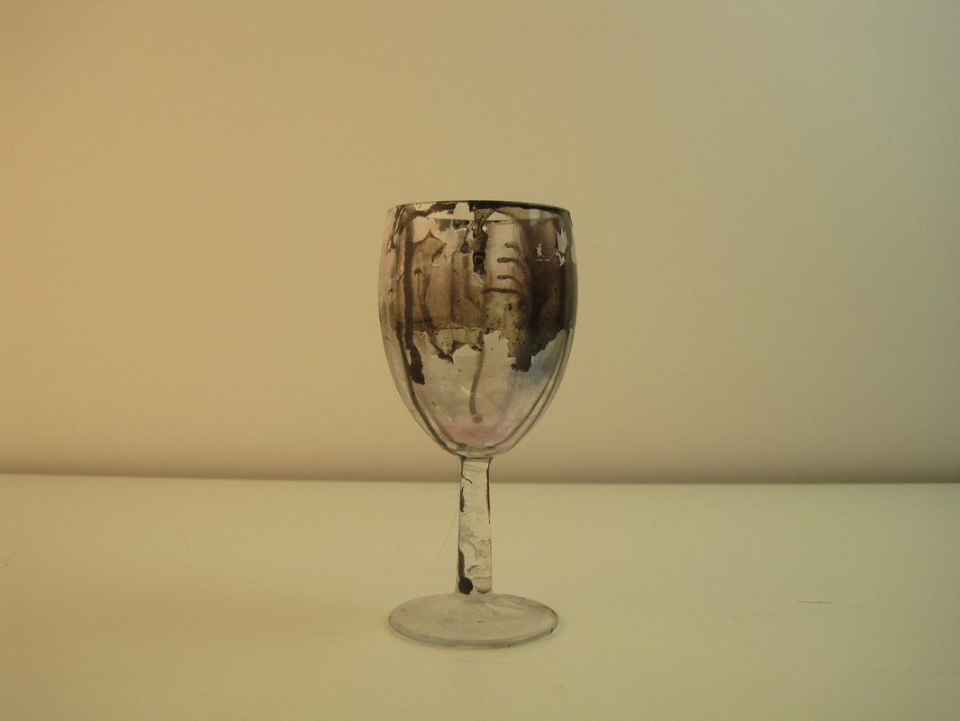
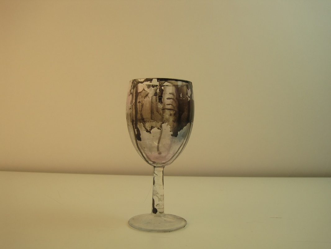
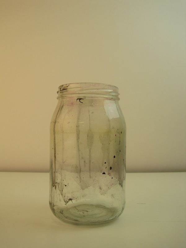
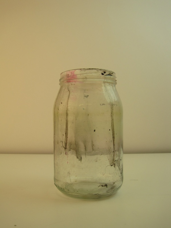
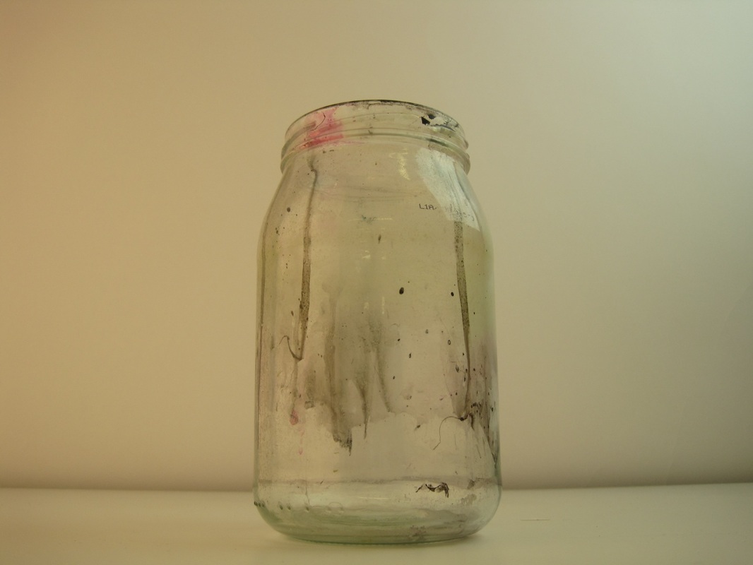
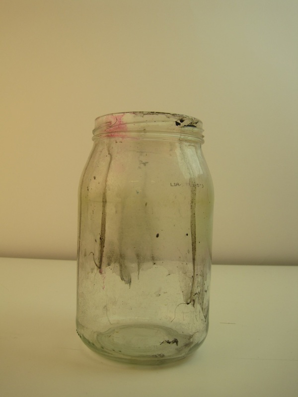
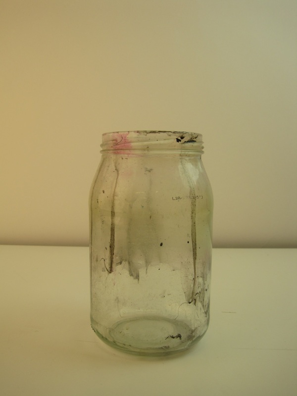
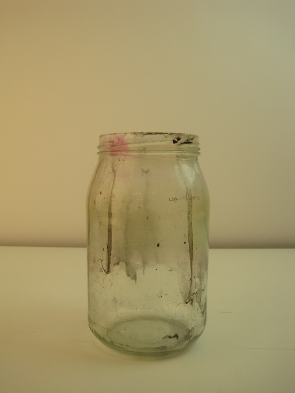
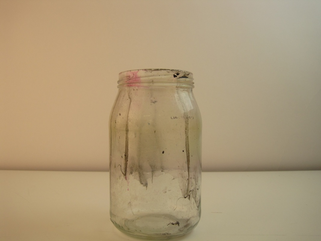
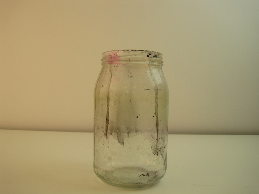
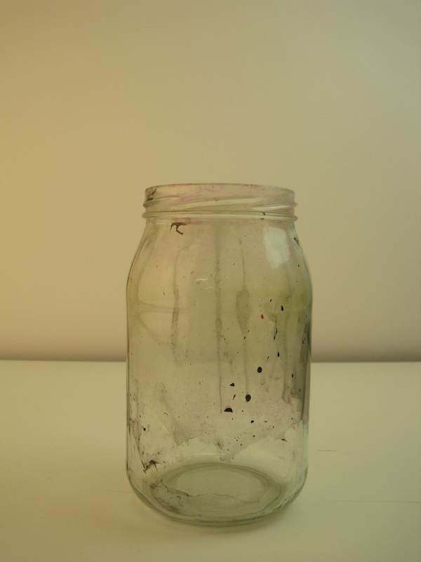
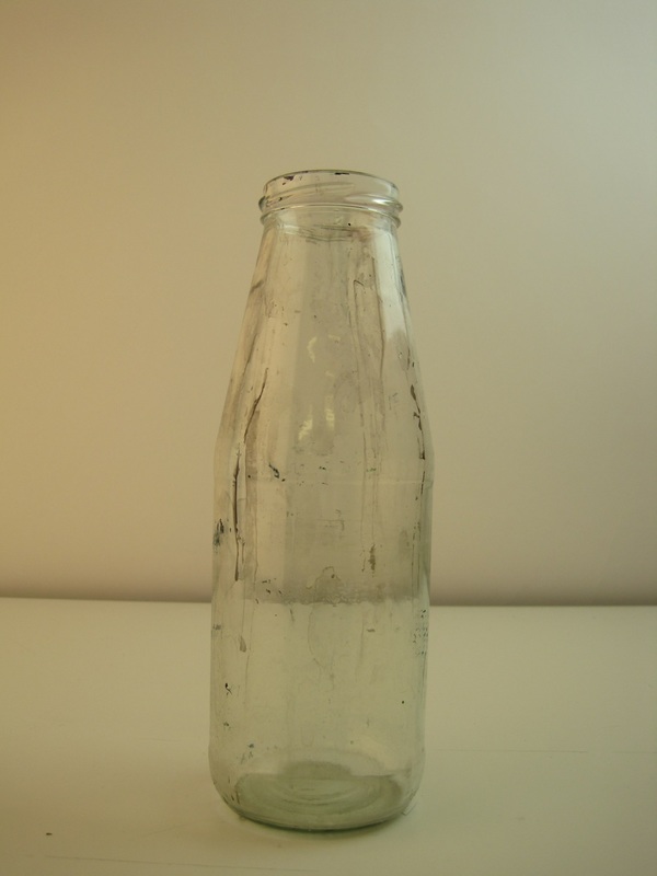
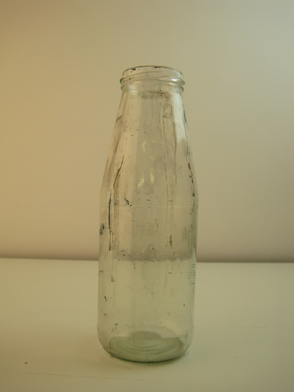
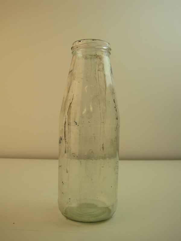
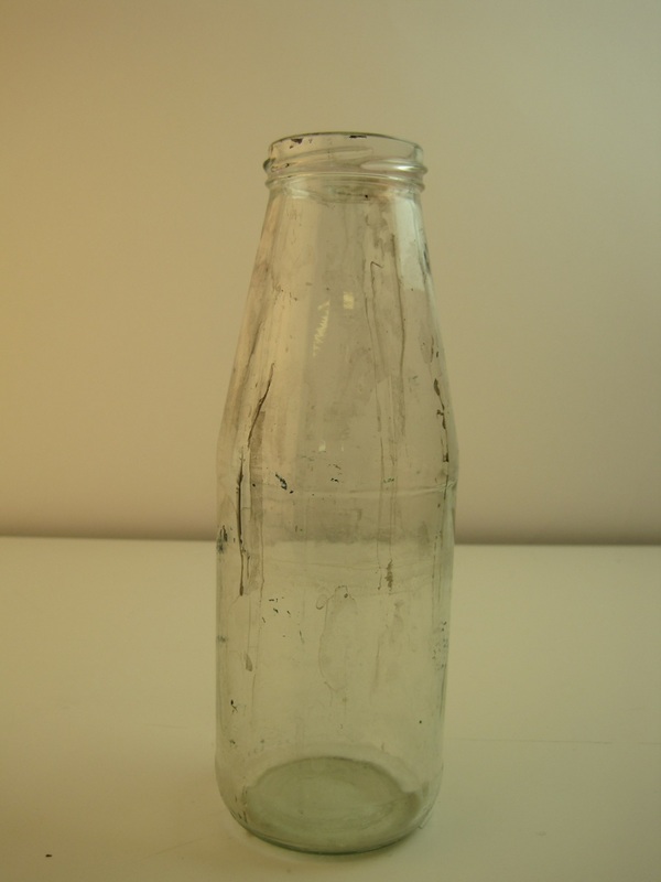
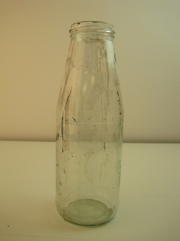
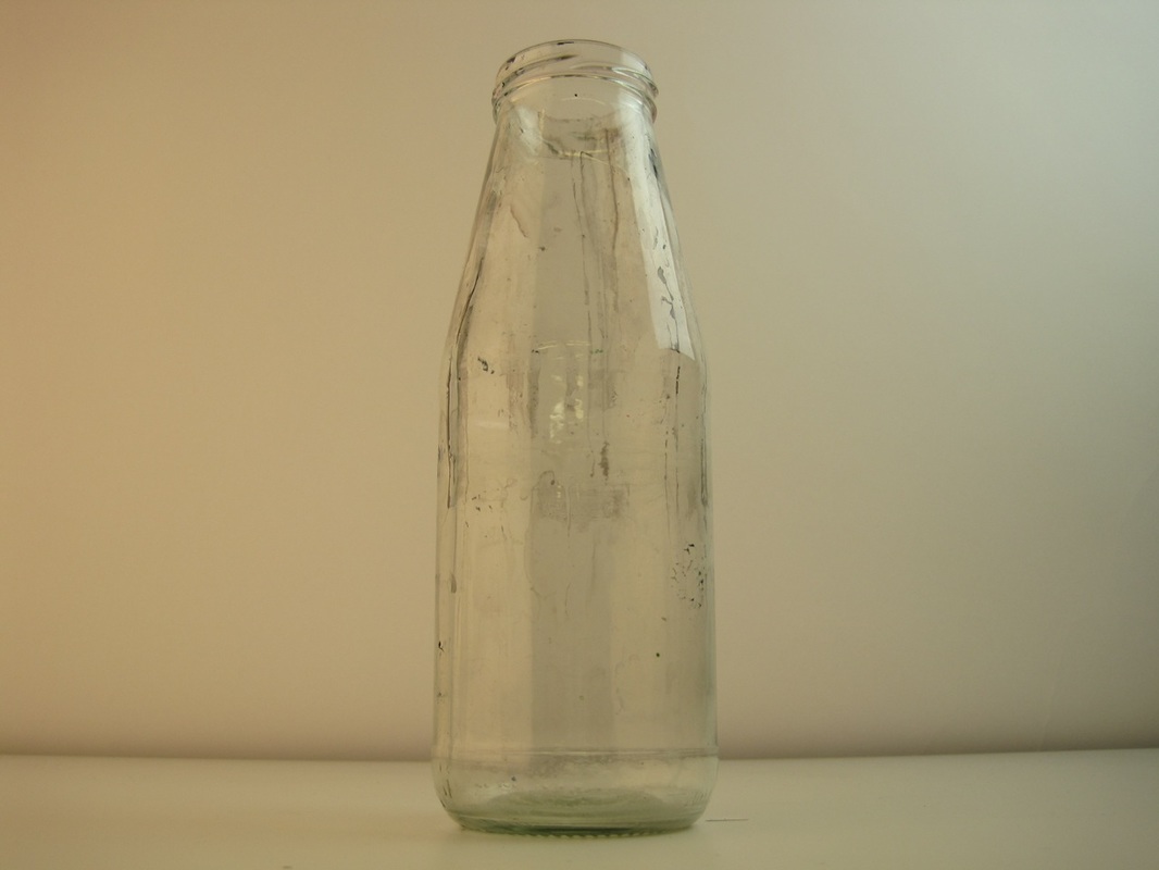
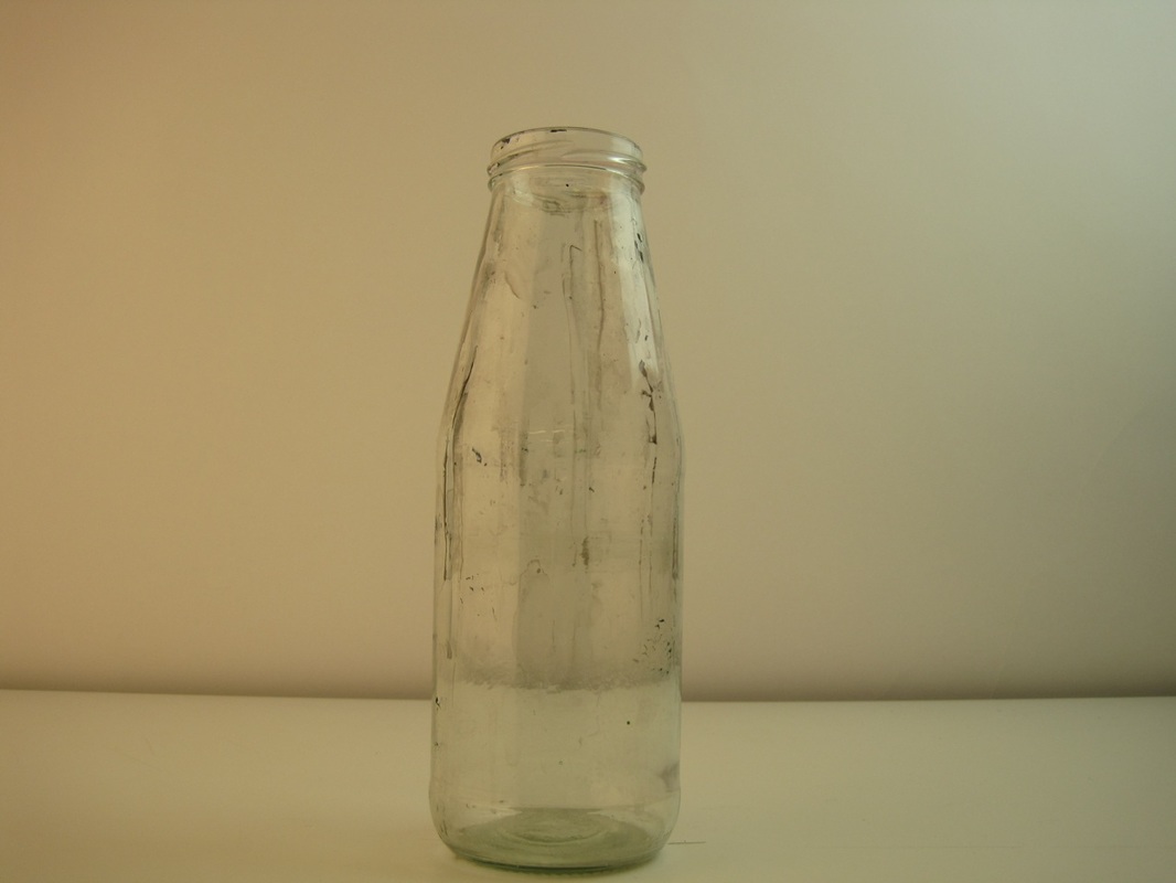
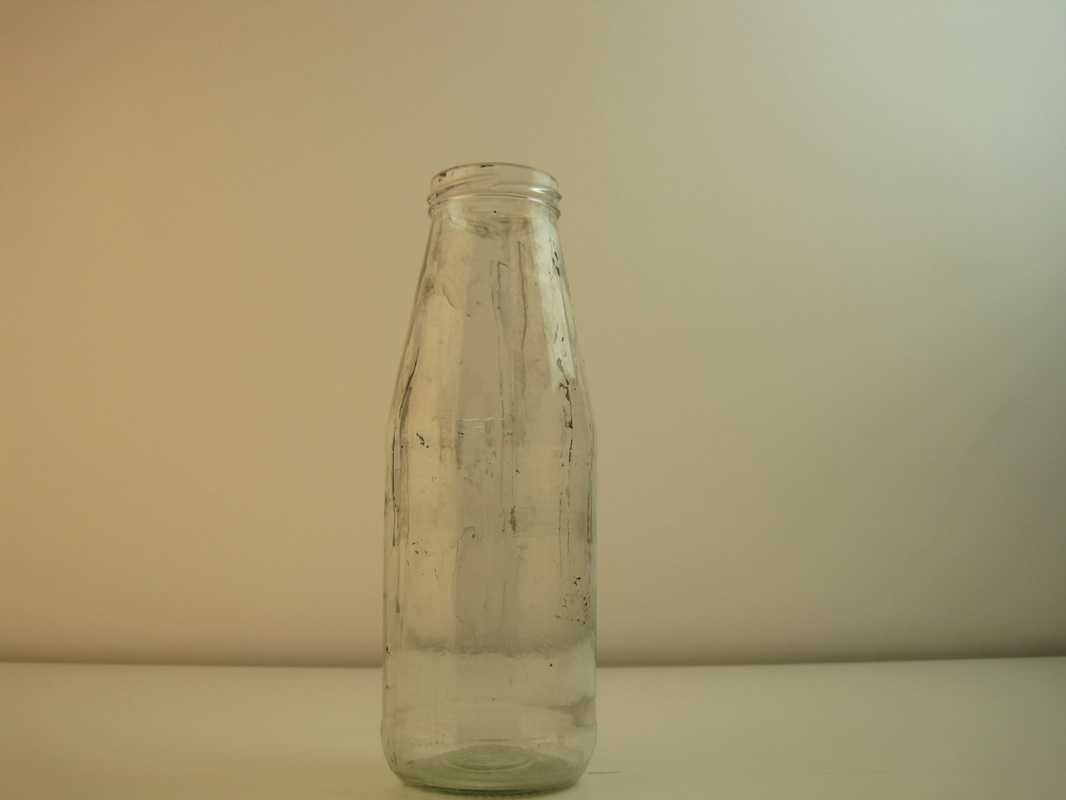
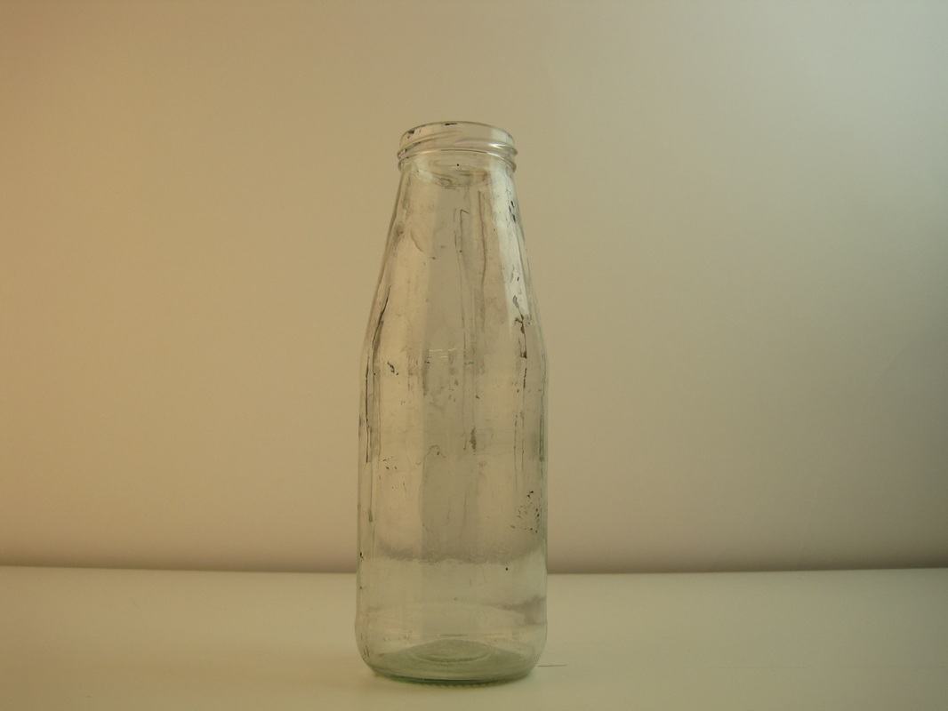
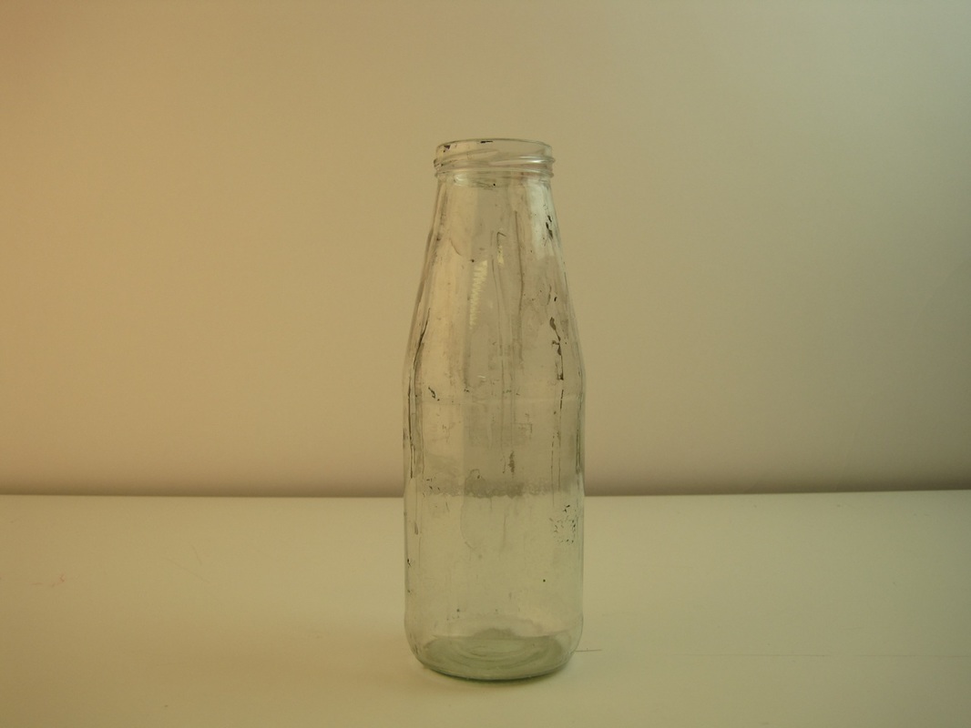
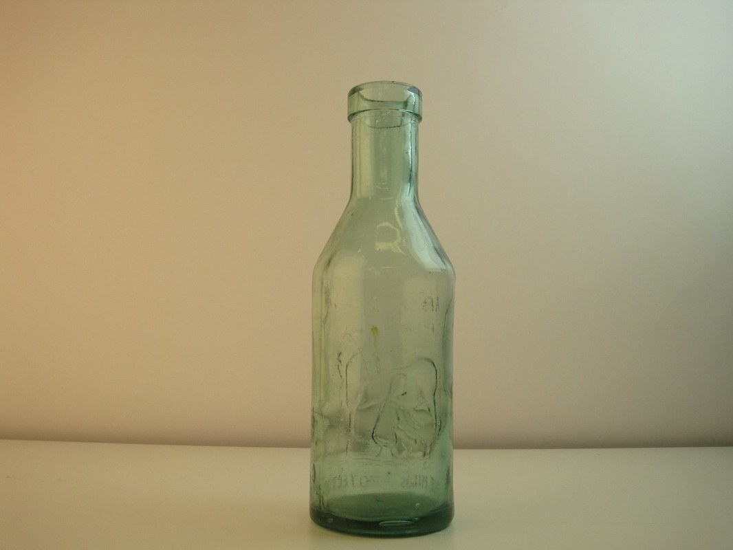
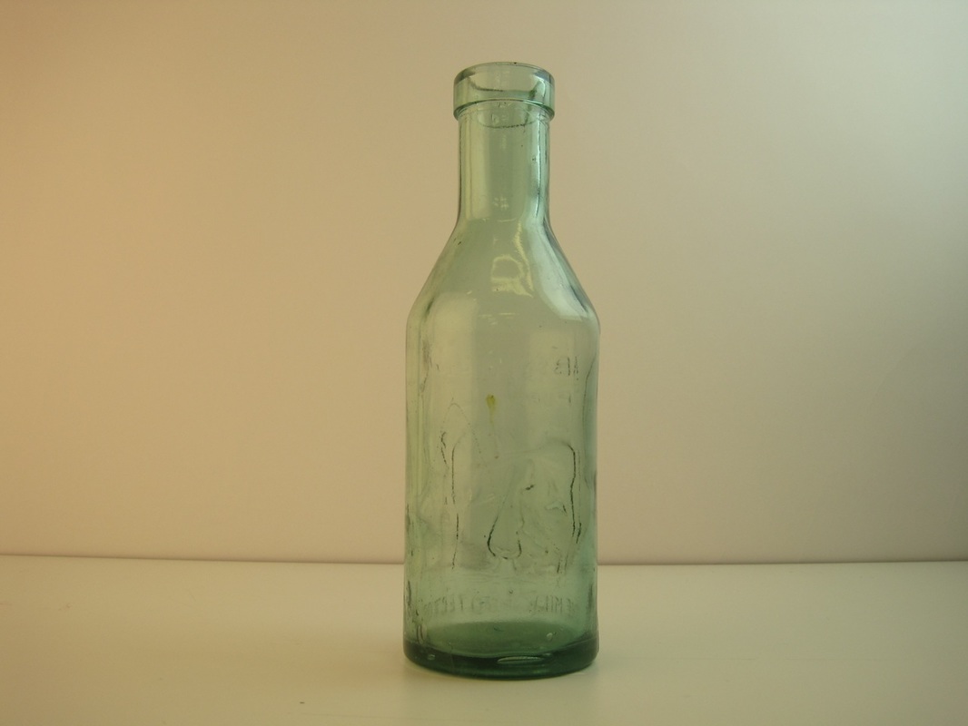
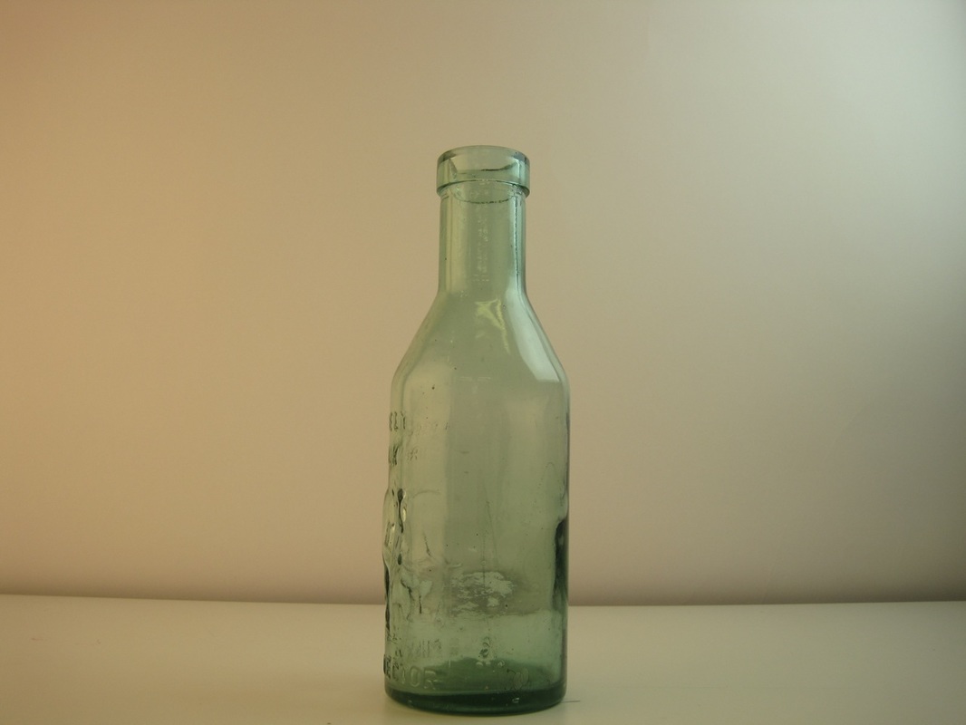
Process
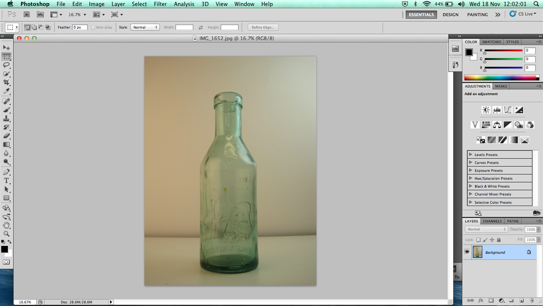
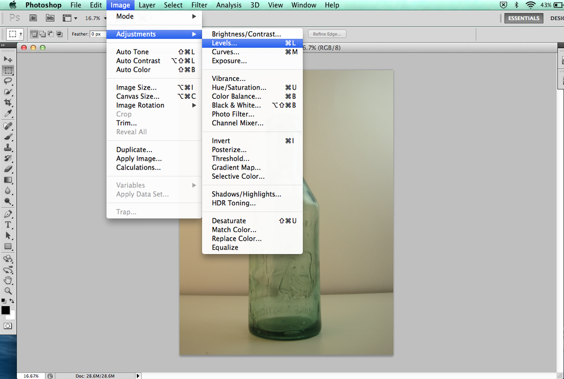
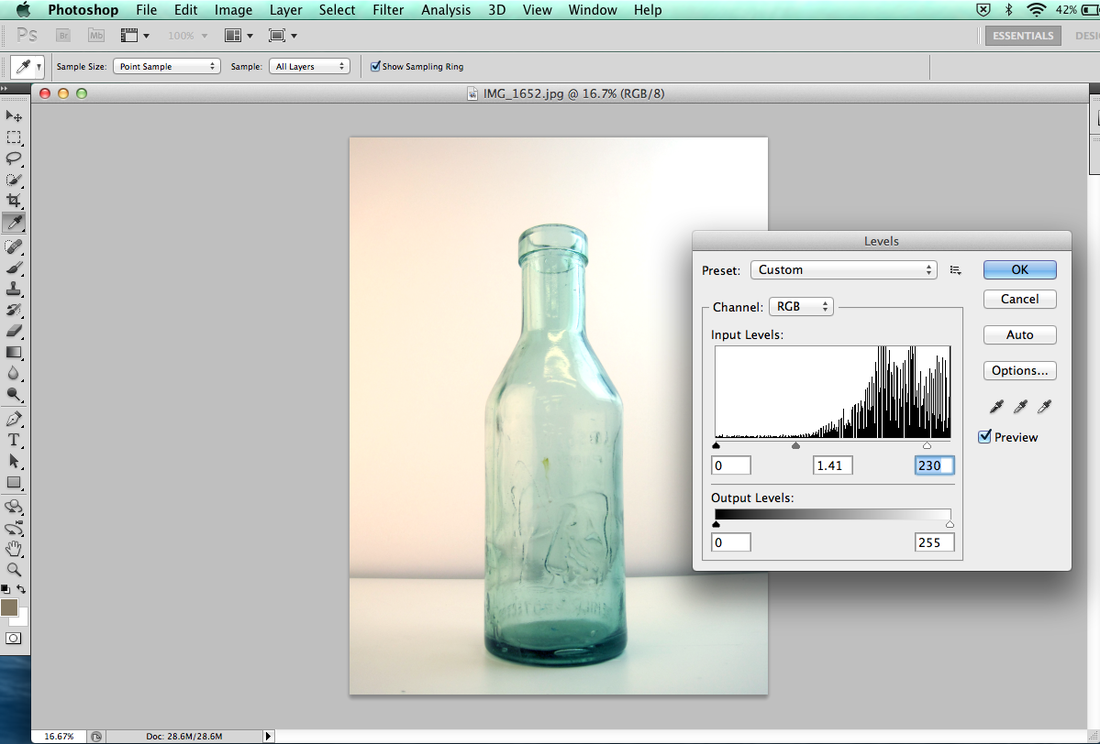
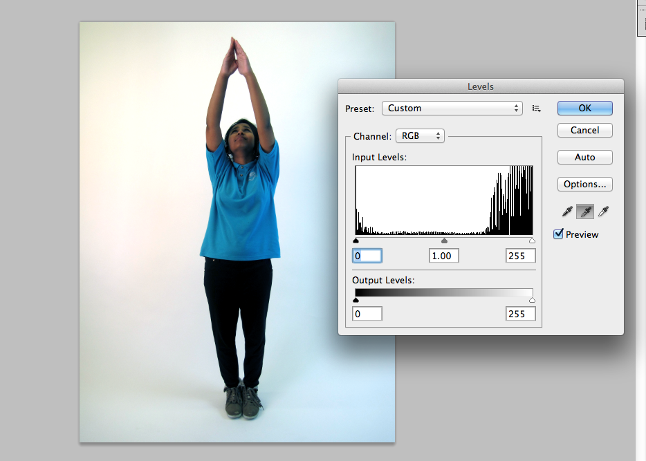
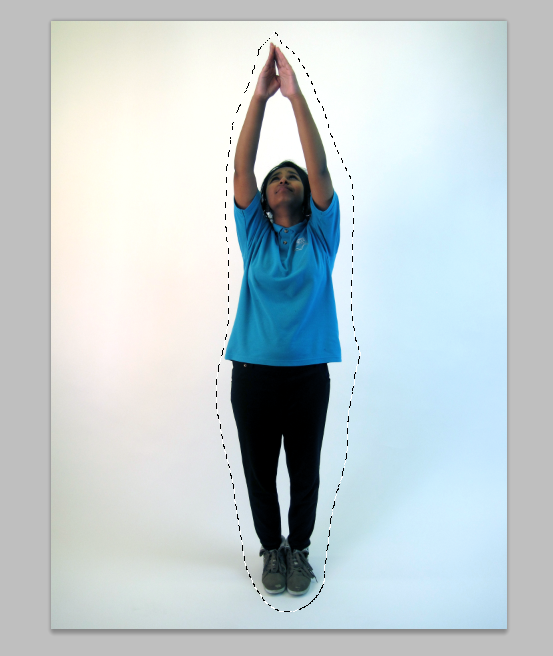
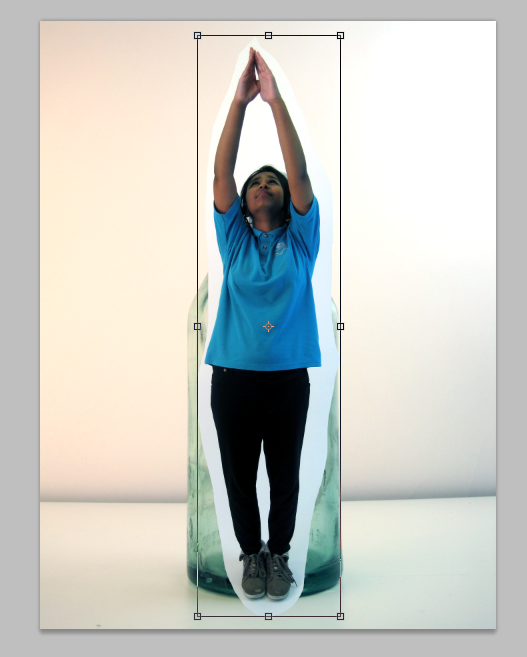
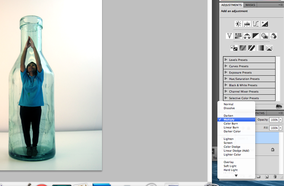
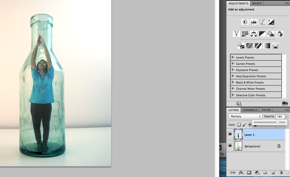
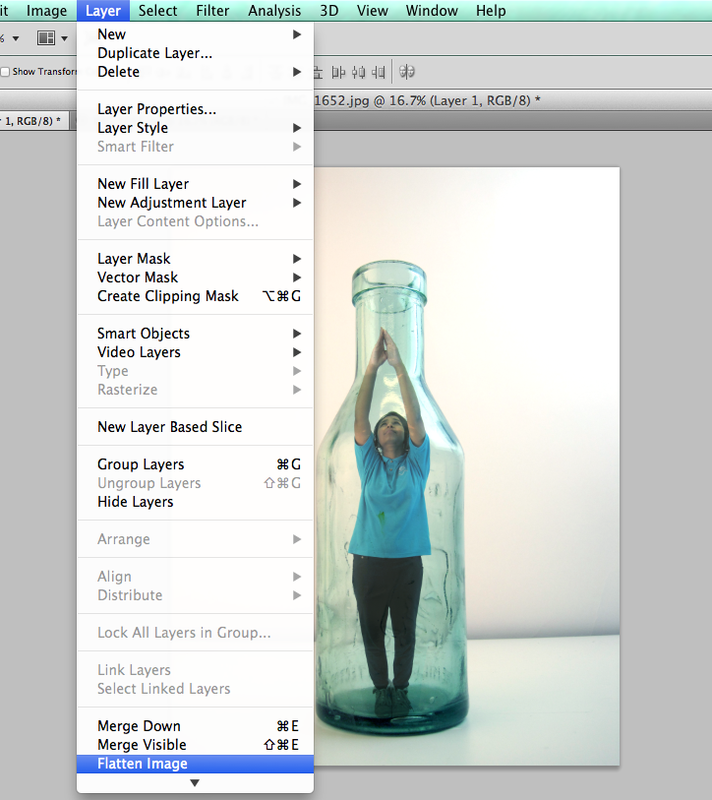
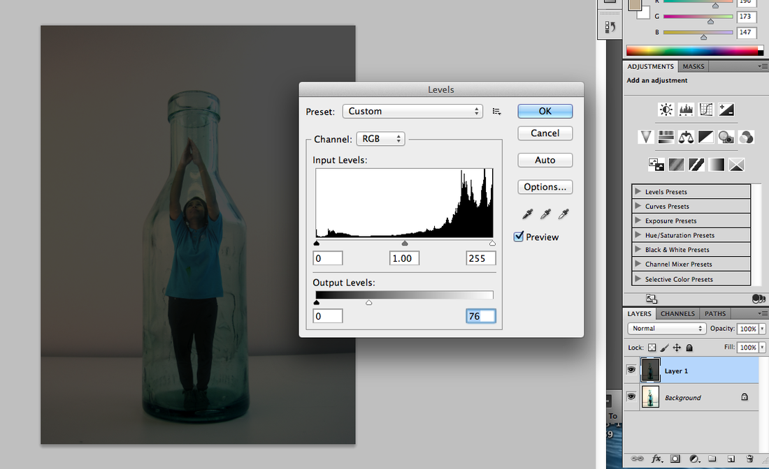
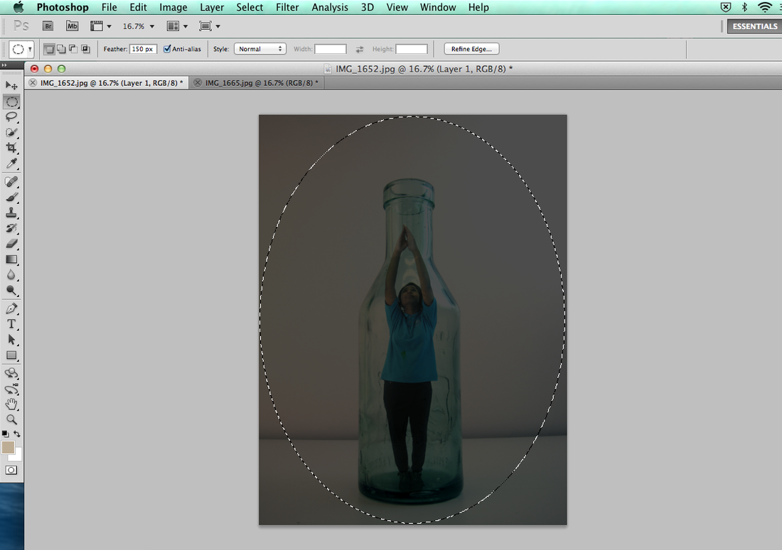
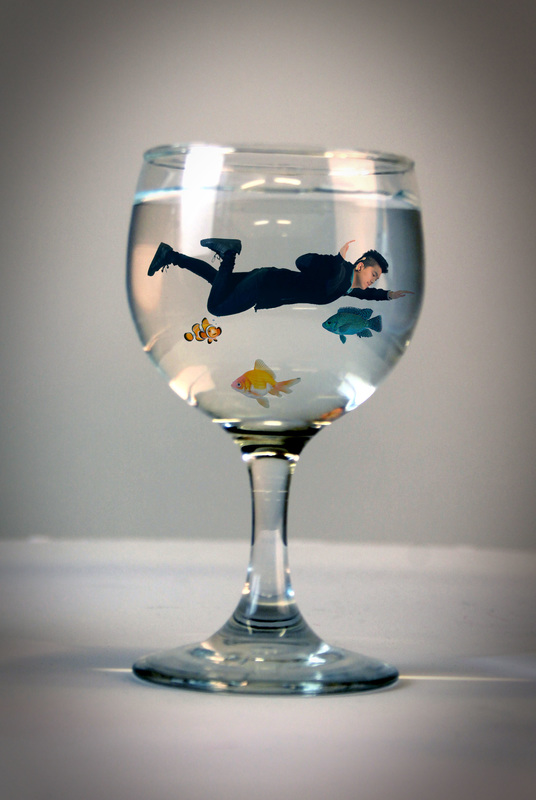
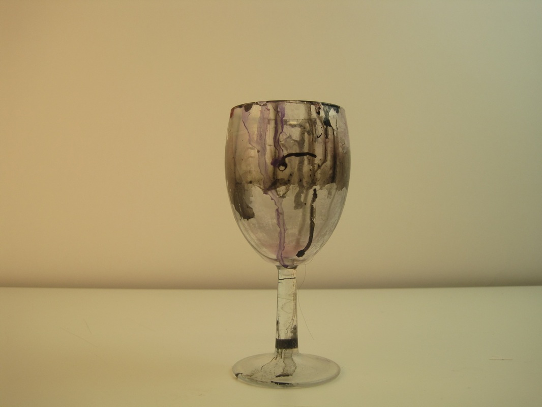
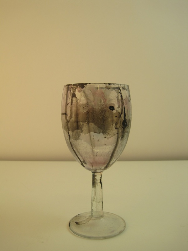
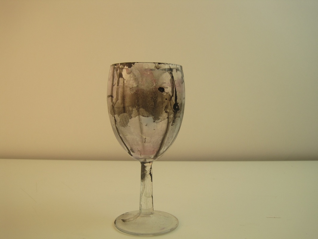
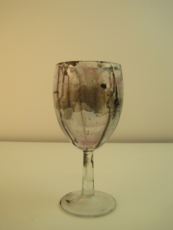
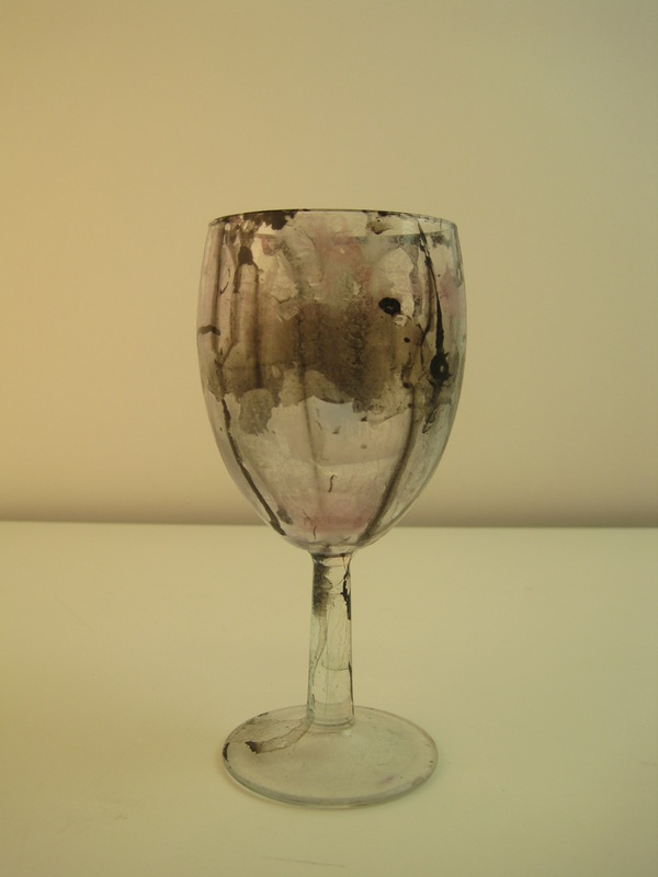
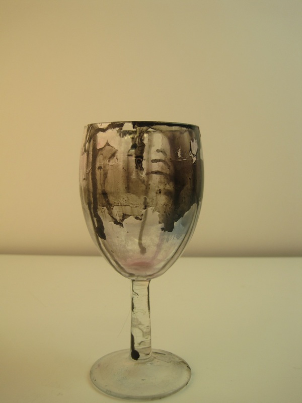
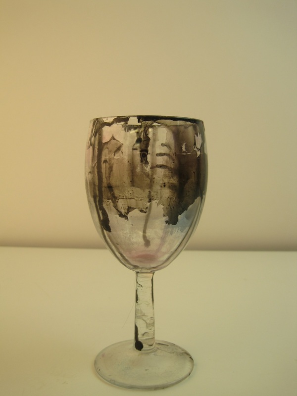
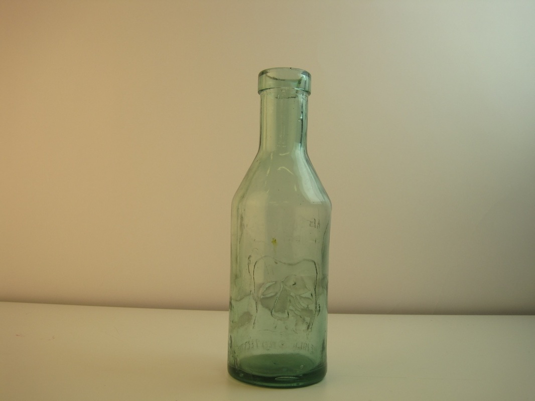
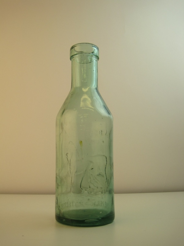
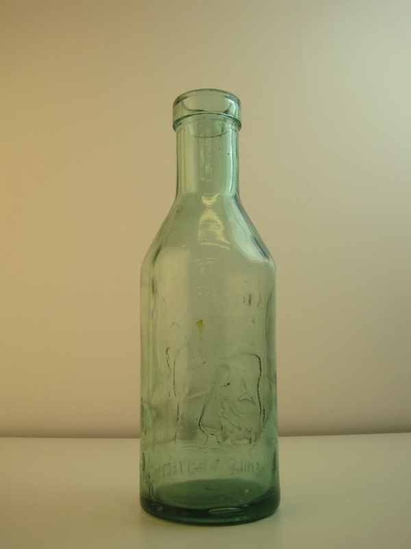
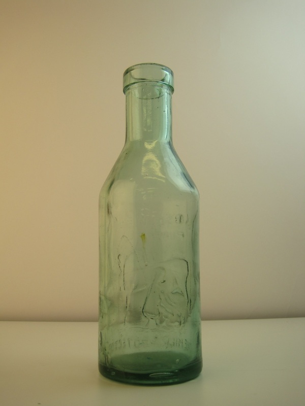
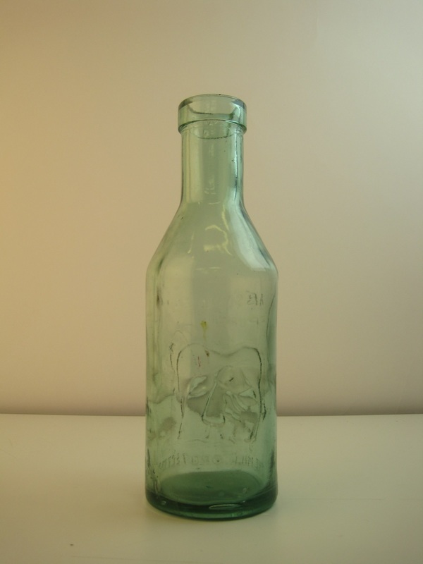
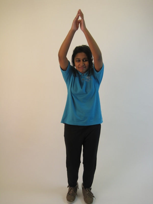
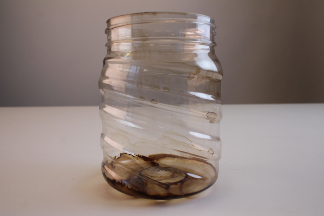
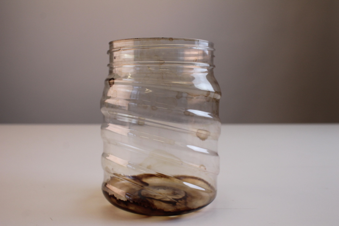
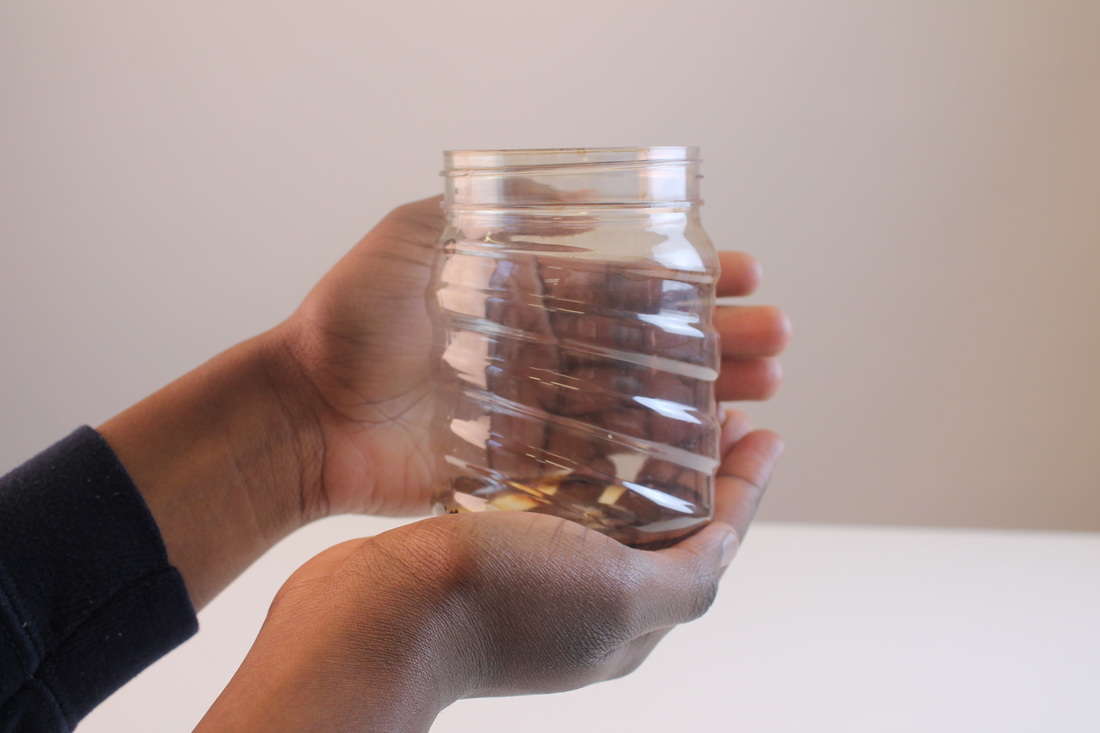
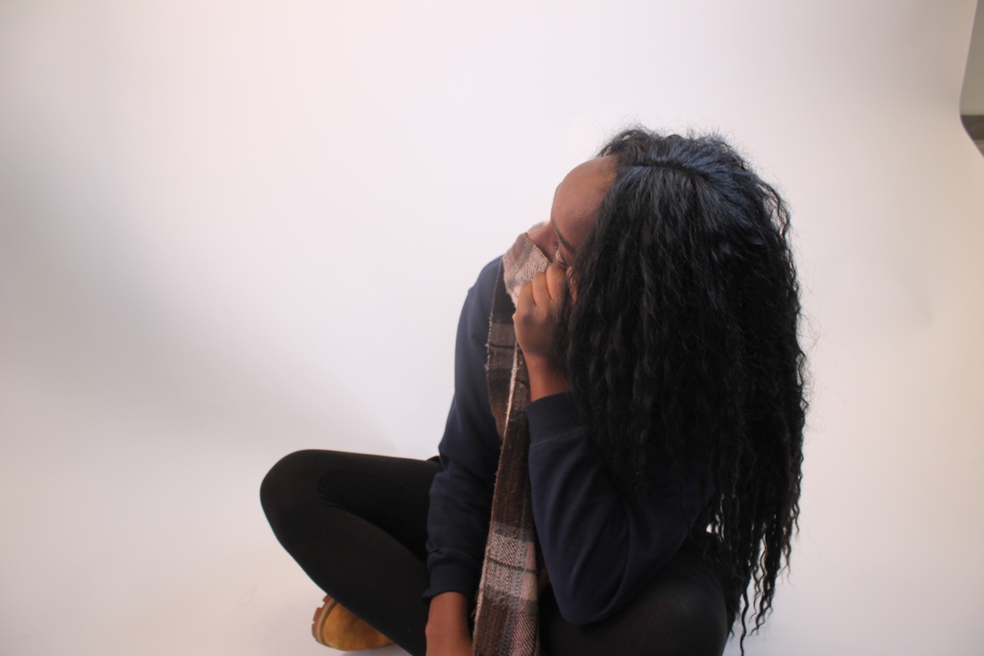
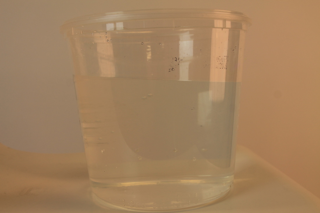
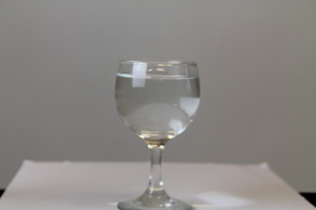
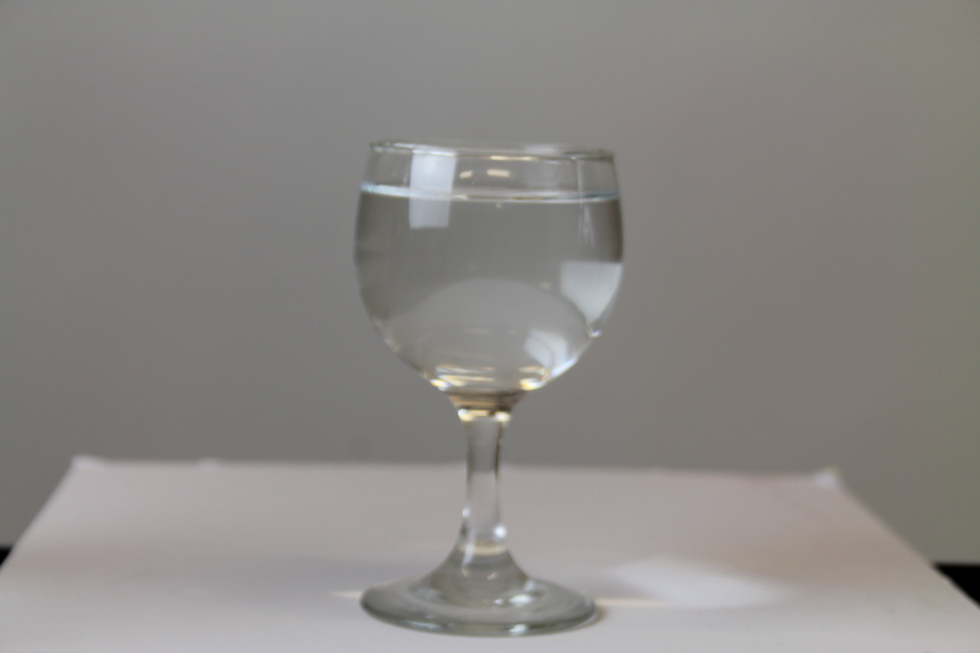
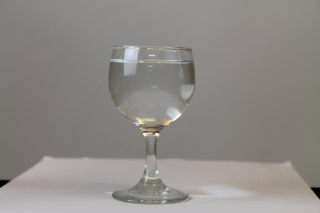
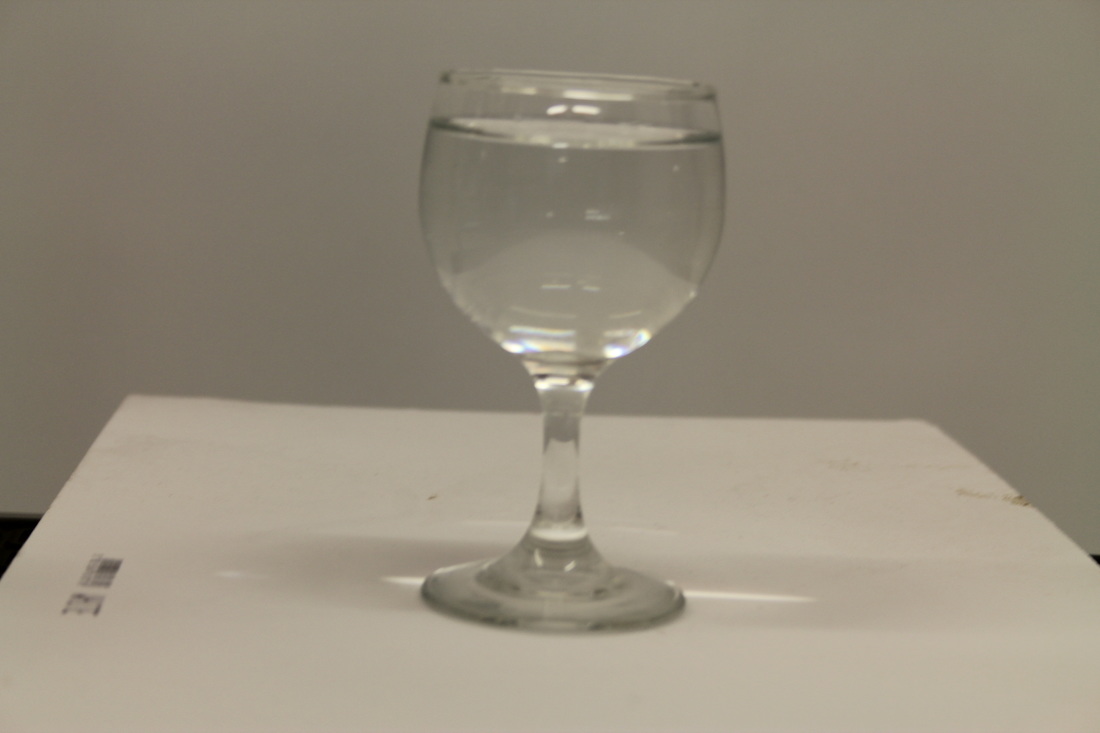
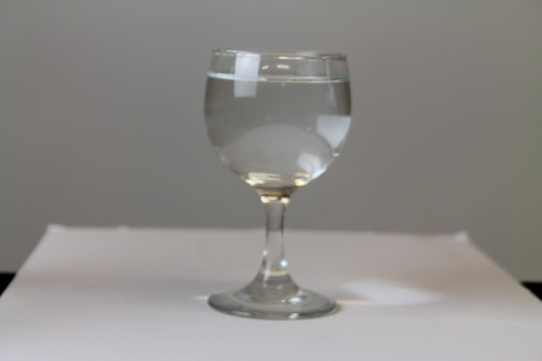
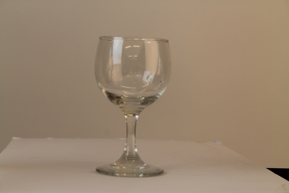
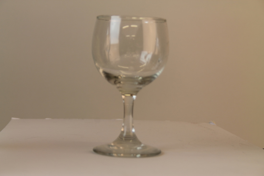
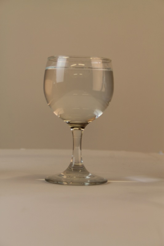
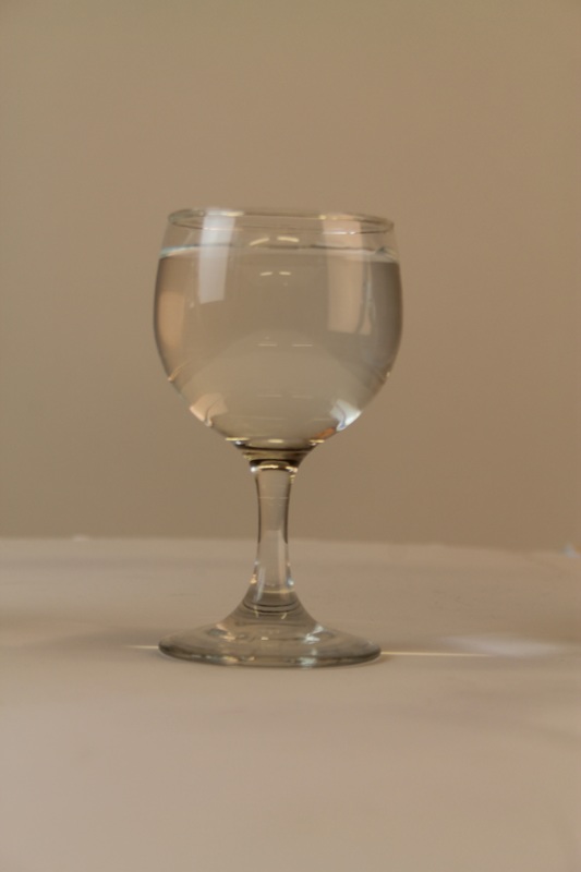
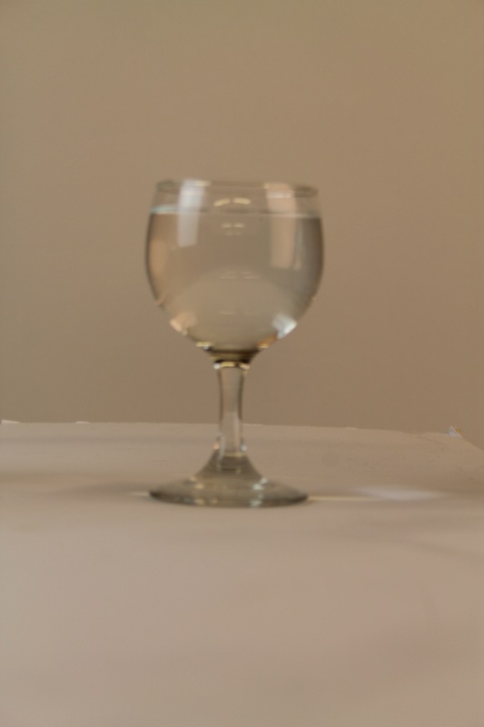
This is the process to get my first final image done, along with screenshots of how I did it. The first thing I did was to upload the glass image to Photoshop, then I adjusted the levels to make the photo brighter, and changed the colour of the photo, by going on the menu bar>image>adjustment then levels. After that, I adjusted the bottom of the glass to make it darker, then changed the colour of the background and, finally, the rest of the bottle. I added a photo of Nazmin and drew around her with one of the object tools on the bar on the side menu bar, then copied and pasted her onto the photo of the glass bottle. Then I press 'cmd' T to make it to the size that I wanted so that the photo of Nazmin would fit inside the bottle. When I'd finished this, I multiplied it to make it look like she was standing in the glass. You could still see a vignette around her so I had to edit that by adjusting the colour of her in the bottle, so that it really looked like she was standing in the bottle. When all of that was completed, I thought about how I could make the photo look better. I clicked on the menu bar that is on the side and selected the 2nd top object and chose the circle. I then drew a circle around the bottle and adjusted it again by going to image> adjustment>levels then I adjust it in a different way. This is how I created my first final image.
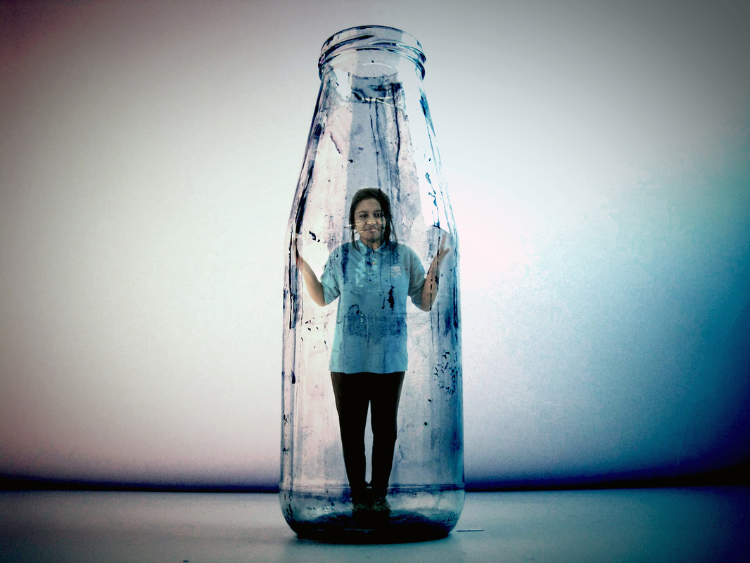
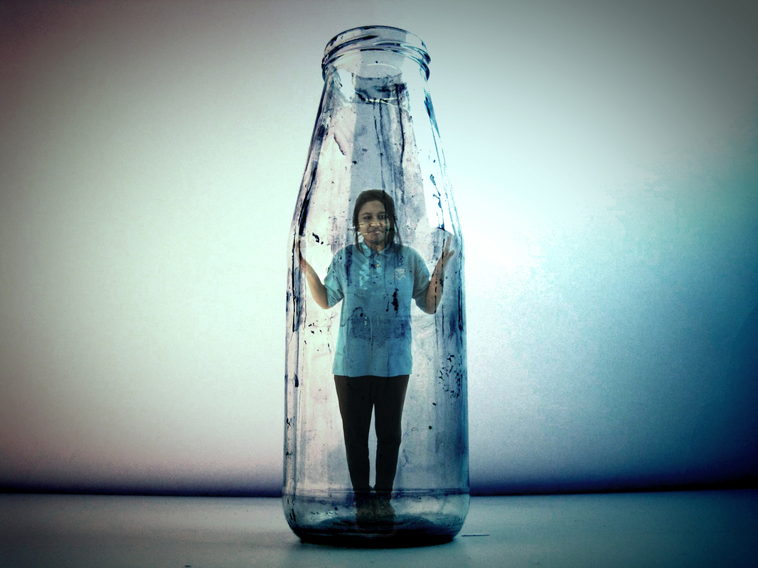

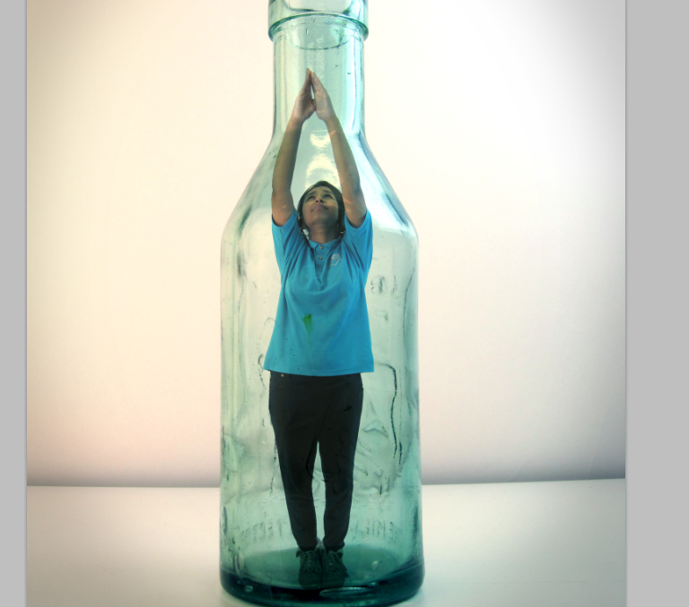
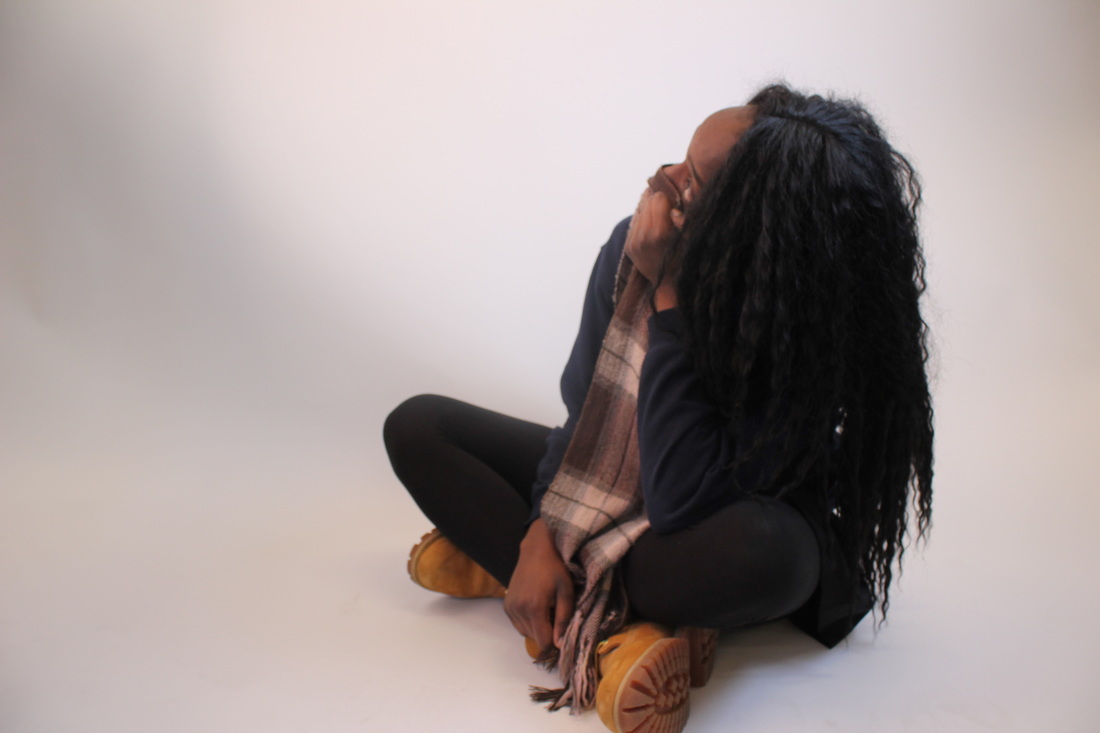
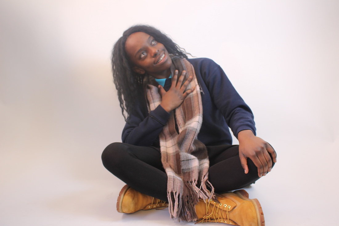
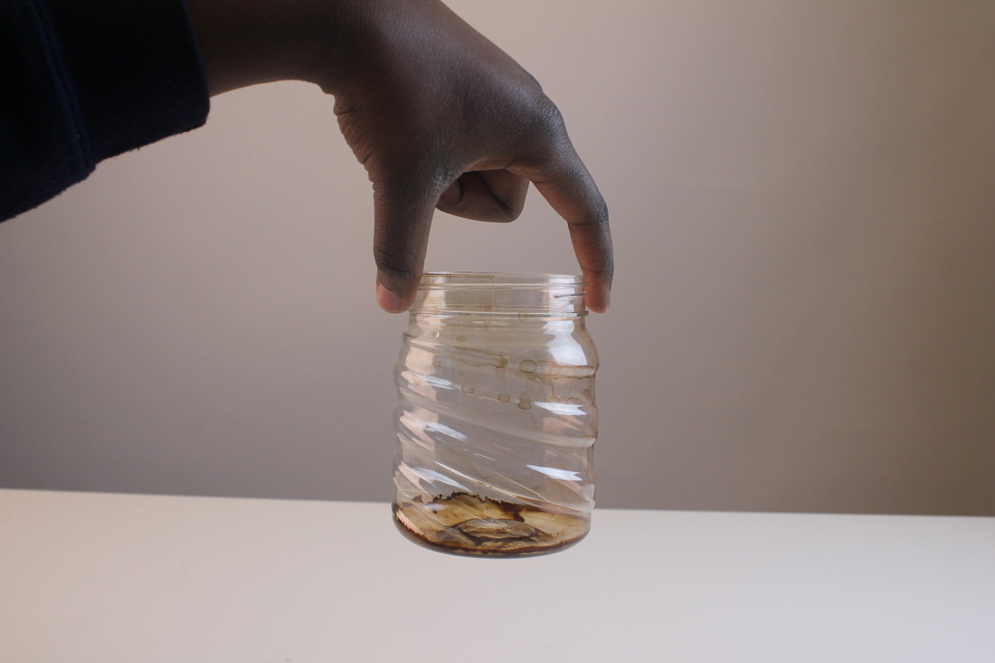
This is what I came up with eventually. When I look at these photos, it looks like the girl is actually in the glass or jar, but when I think about it I remember that I edited it in photoshop.
These photos look amazing. It's very dark and kind of gloomy in a way, and the end of the photo it smooths out and fades away, which is what makes the photo also looks better.
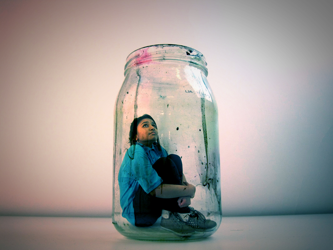
I chose this picture as my final image, because of the way the photo looks. It has been flattened and blended in well with the glass, the way the girl is sitting down in the glass matches the photo and it looks quite cold in a way.
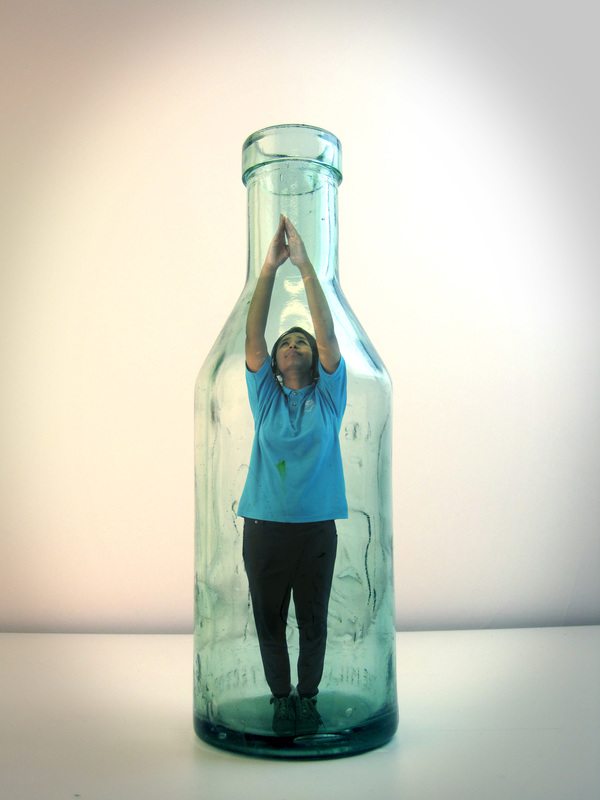
These photos look amazing. It's very dark and kind of gloomy in a way, and the end of the photo it smooths out and fades away, which is what makes the photo also looks better.
I chose this picture as my final image, because of the way the photo looks. It has been flattened and blended in well with the glass, the way the girl is sitting down in the glass matches the photo and it looks quite cold in a way.
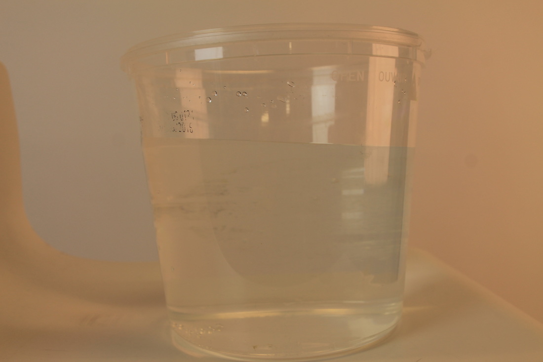
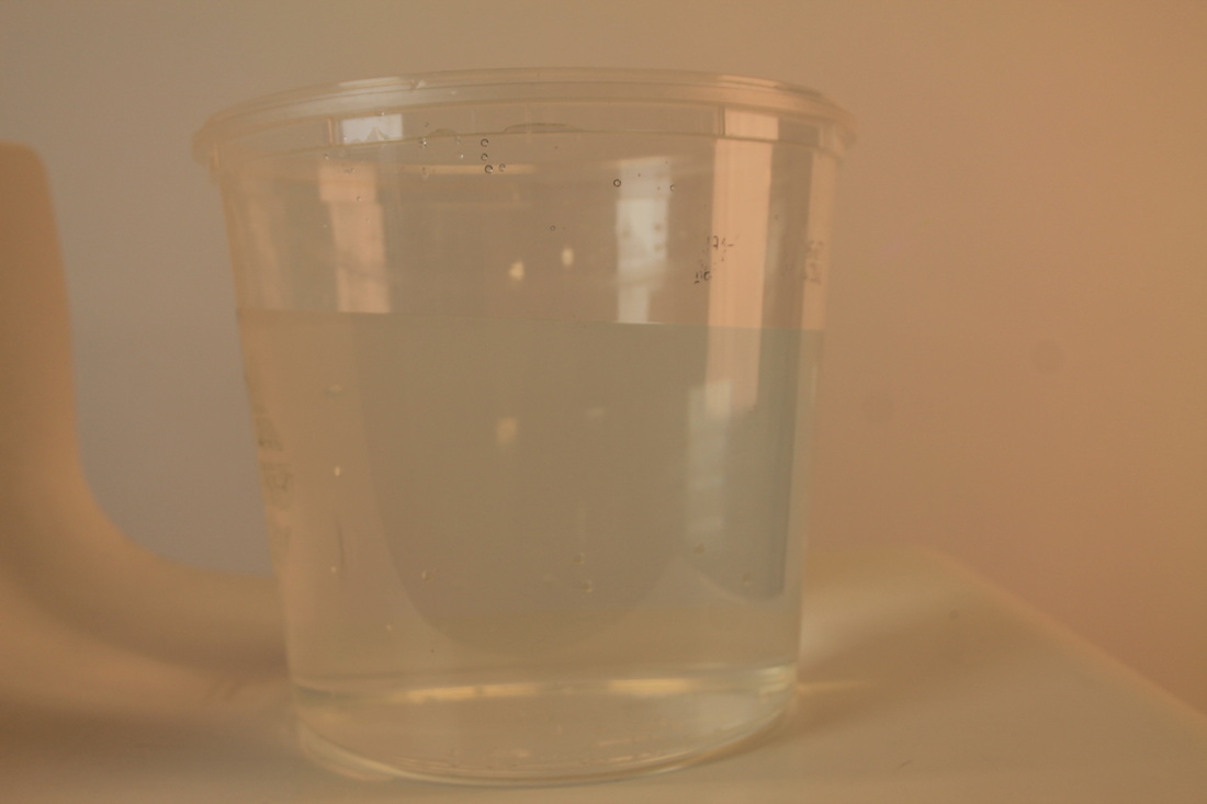
Final image #3 pictures
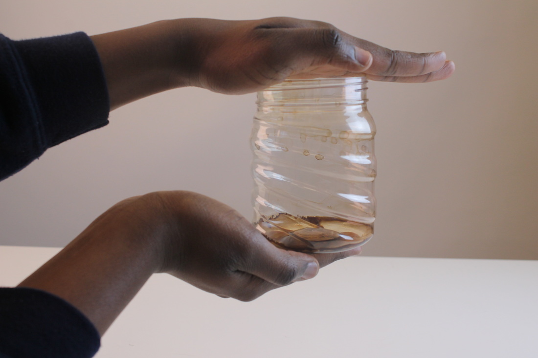
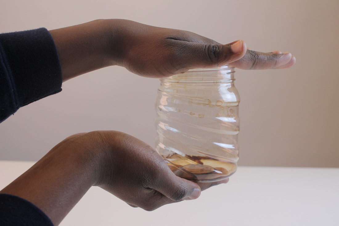

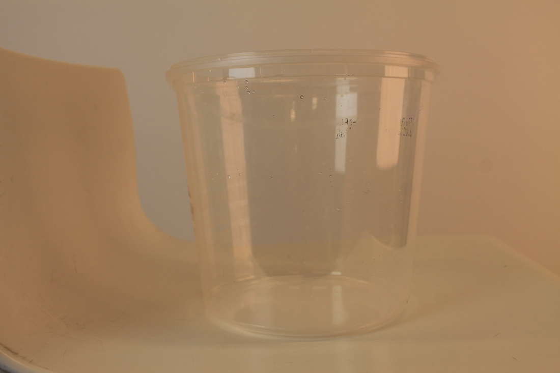
These are photos that my friend took of me. I did this because I thought that I wanted to practice doing a similar picture as before but done in a different way. I thought that I might use a different clear object and I found an empty honey container that I thought might be good. I decided to take a few different photos of it then asked my friend to take a photo of me pretending that I was in the container. My plan was to multiply the two different photos together to make it one and to include this in my final work.
Final image pieces:
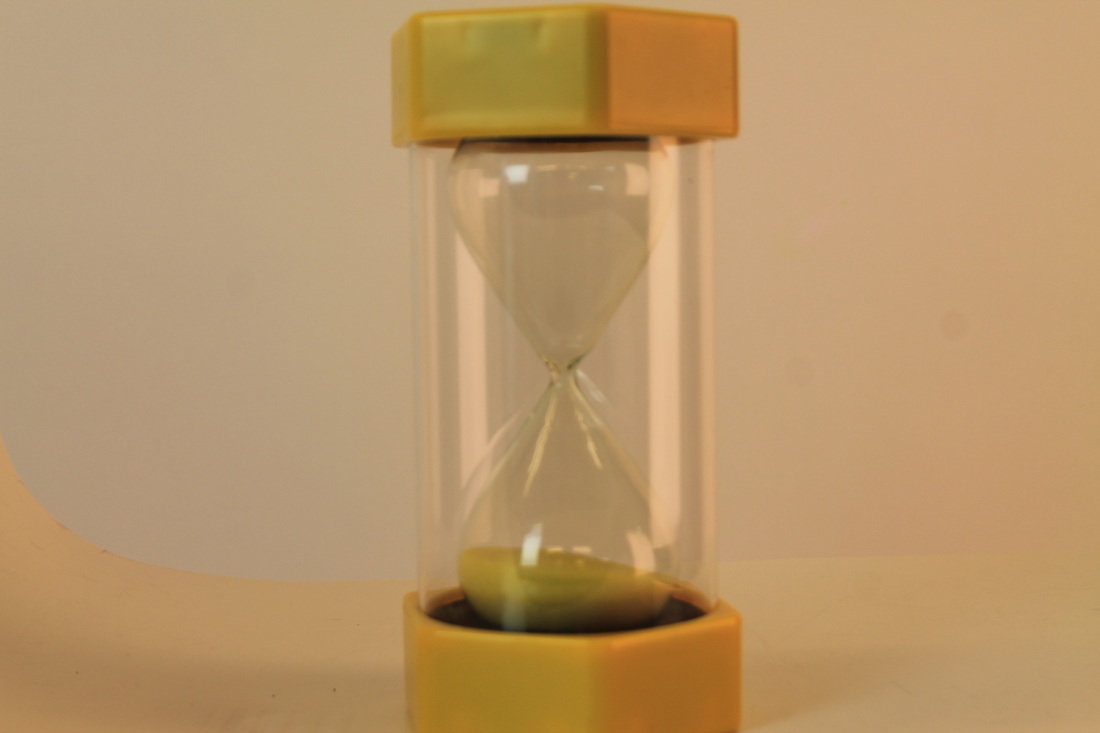
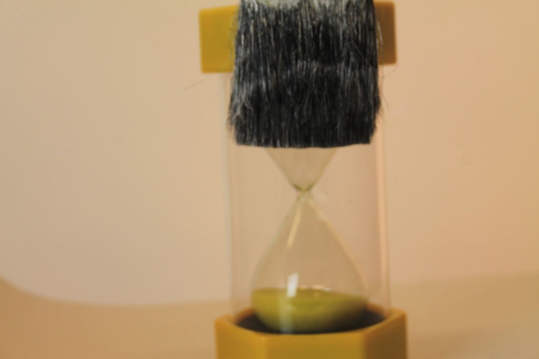
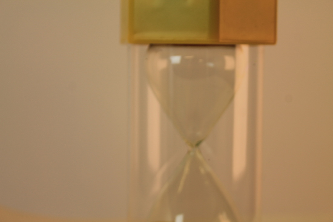
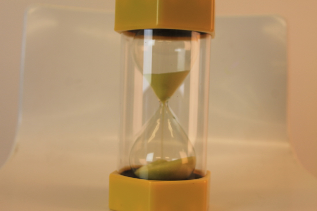
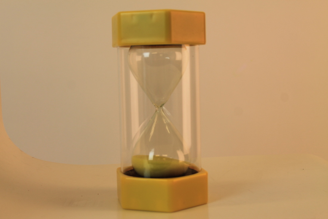
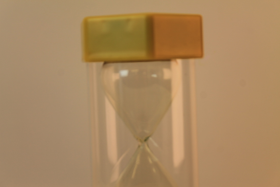
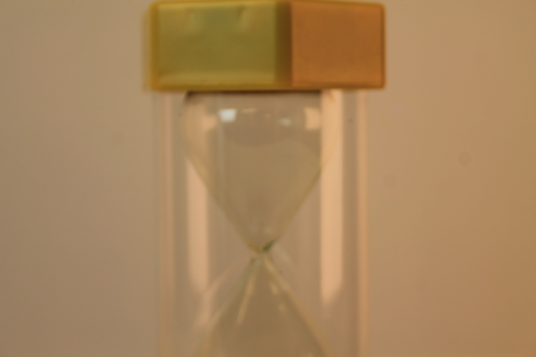
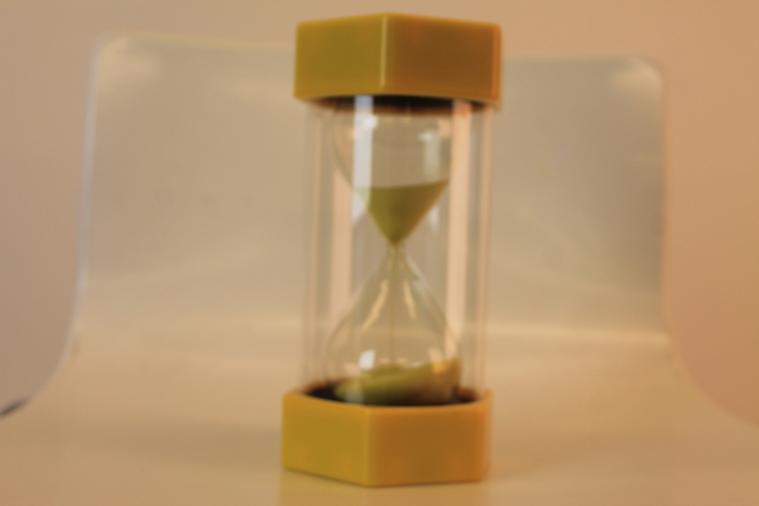
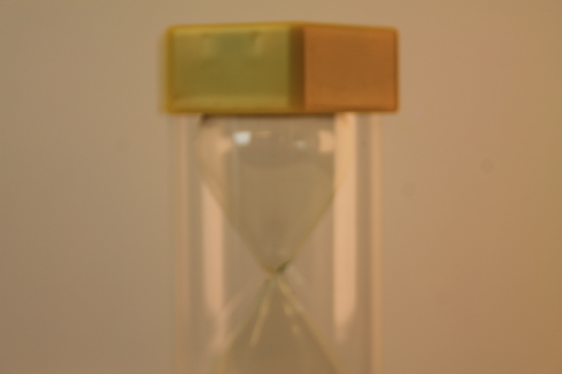
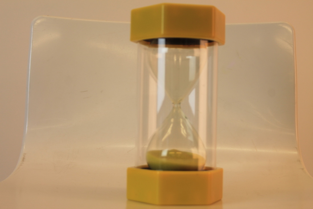
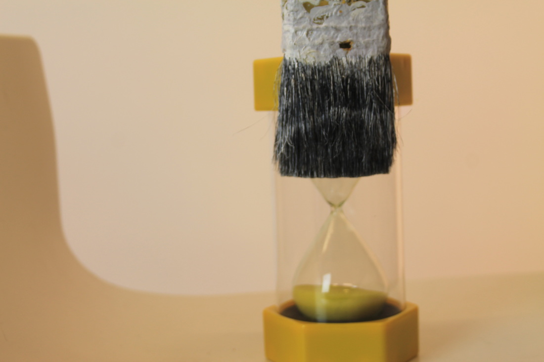
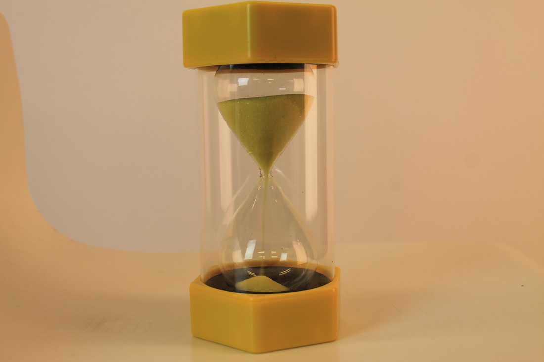
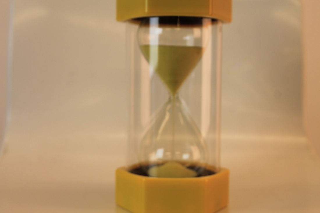
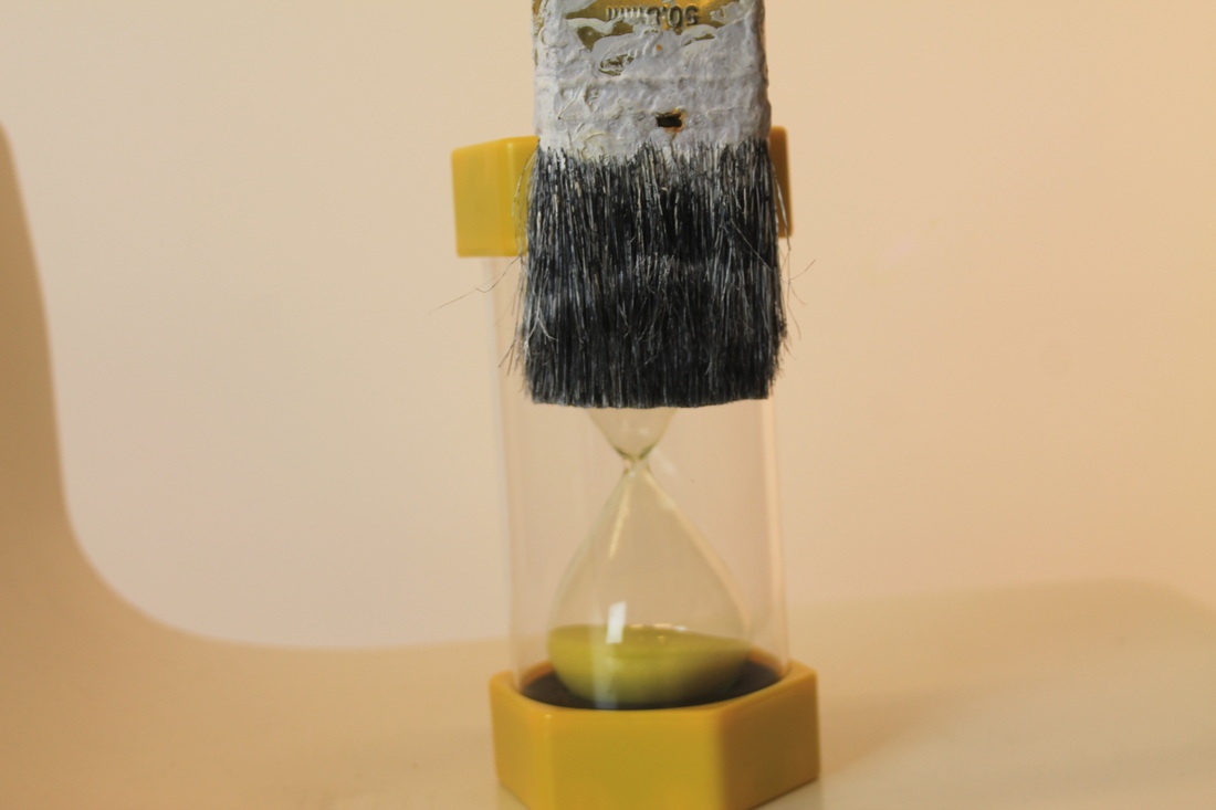
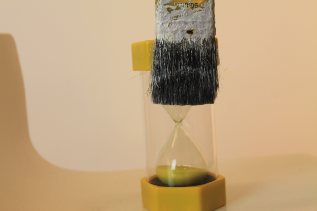
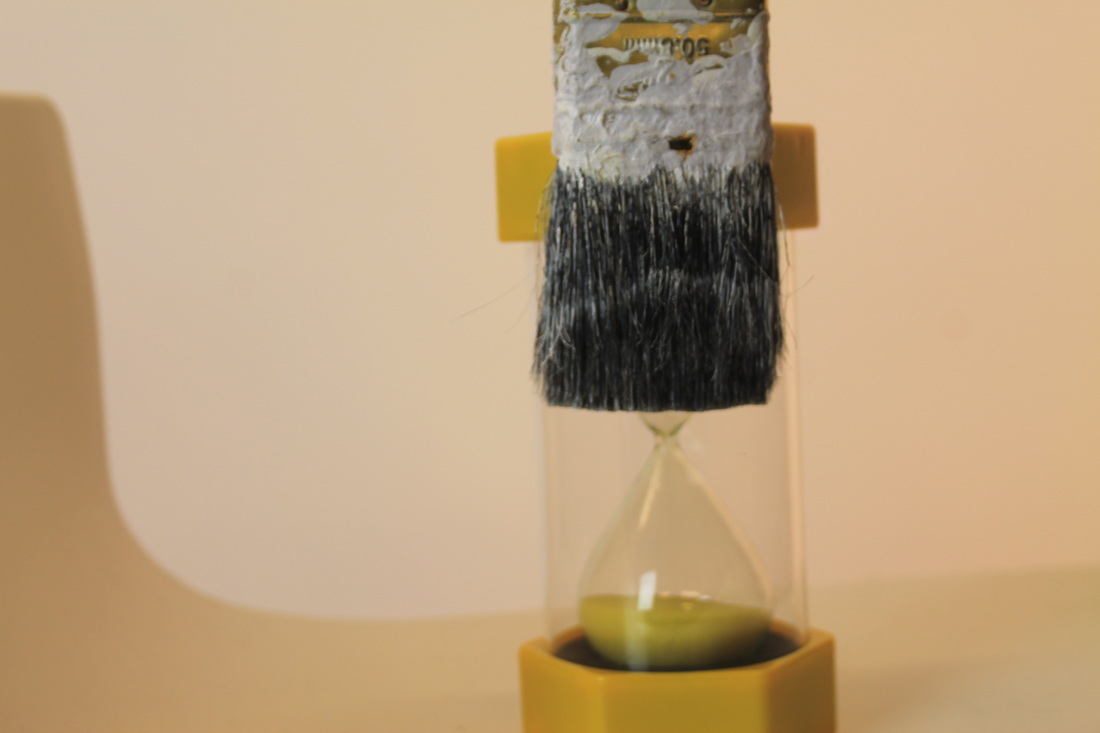
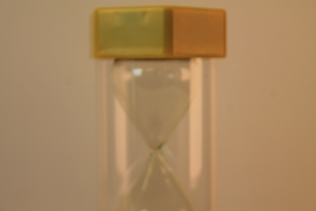

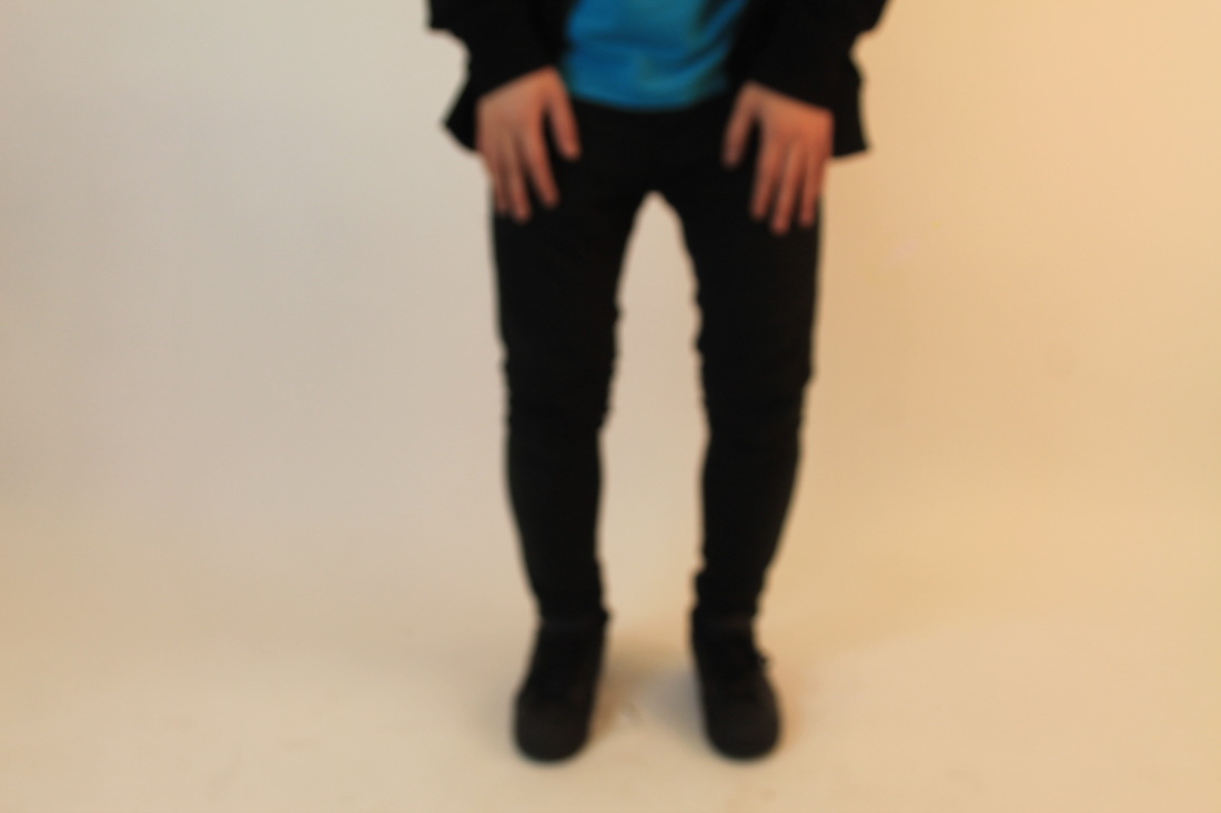
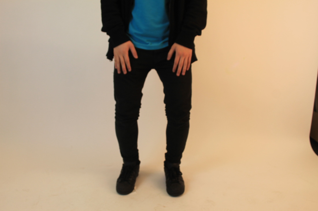
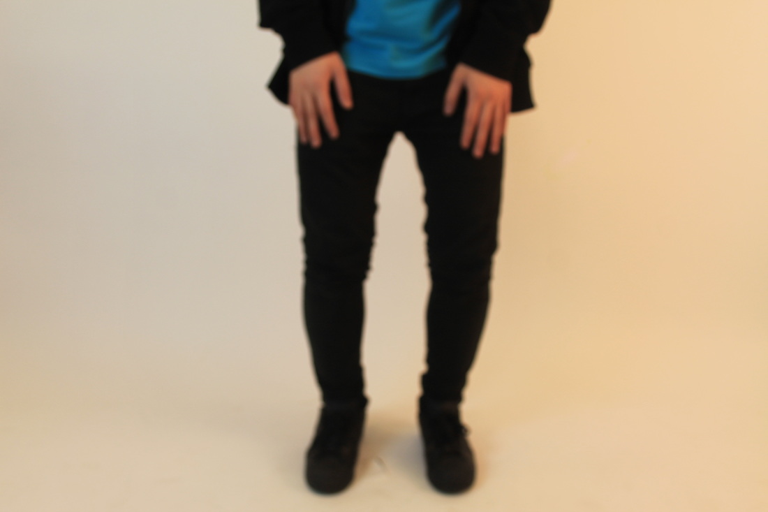
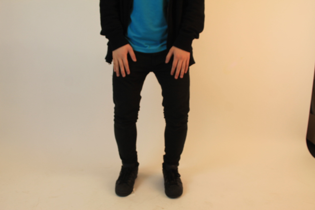
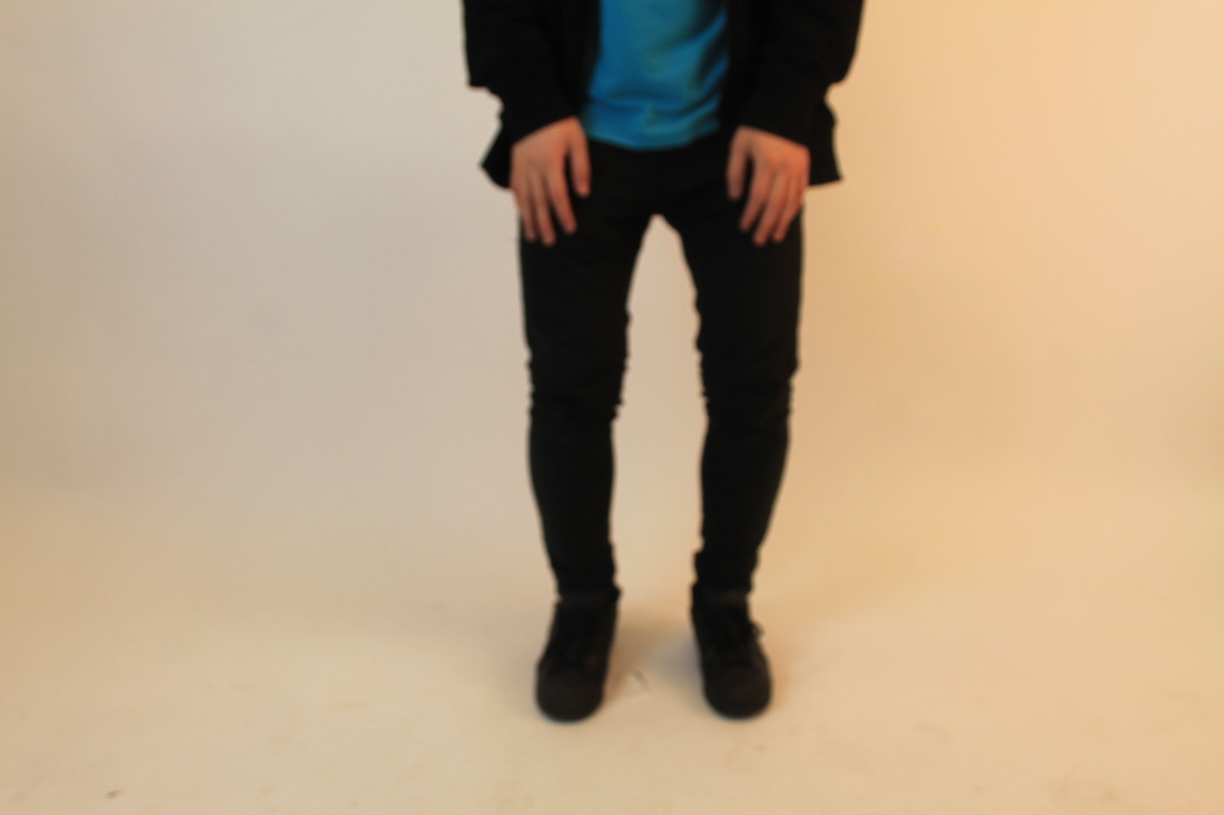
What I have decided to do with these images is blend them in with other pictures, e.g like the egg timer I will blend it in with the boys legs or maybe with water turning into sand. I may add fish, or a person, swimming around in the water in the bucket.
Practice Fianl image
|
|
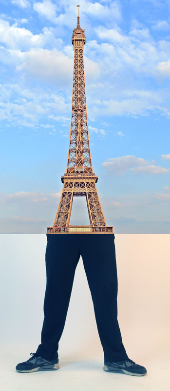
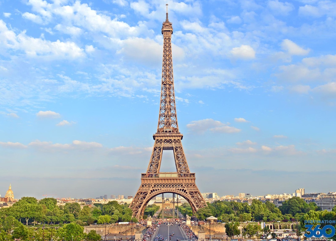
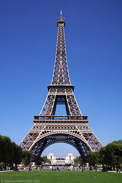
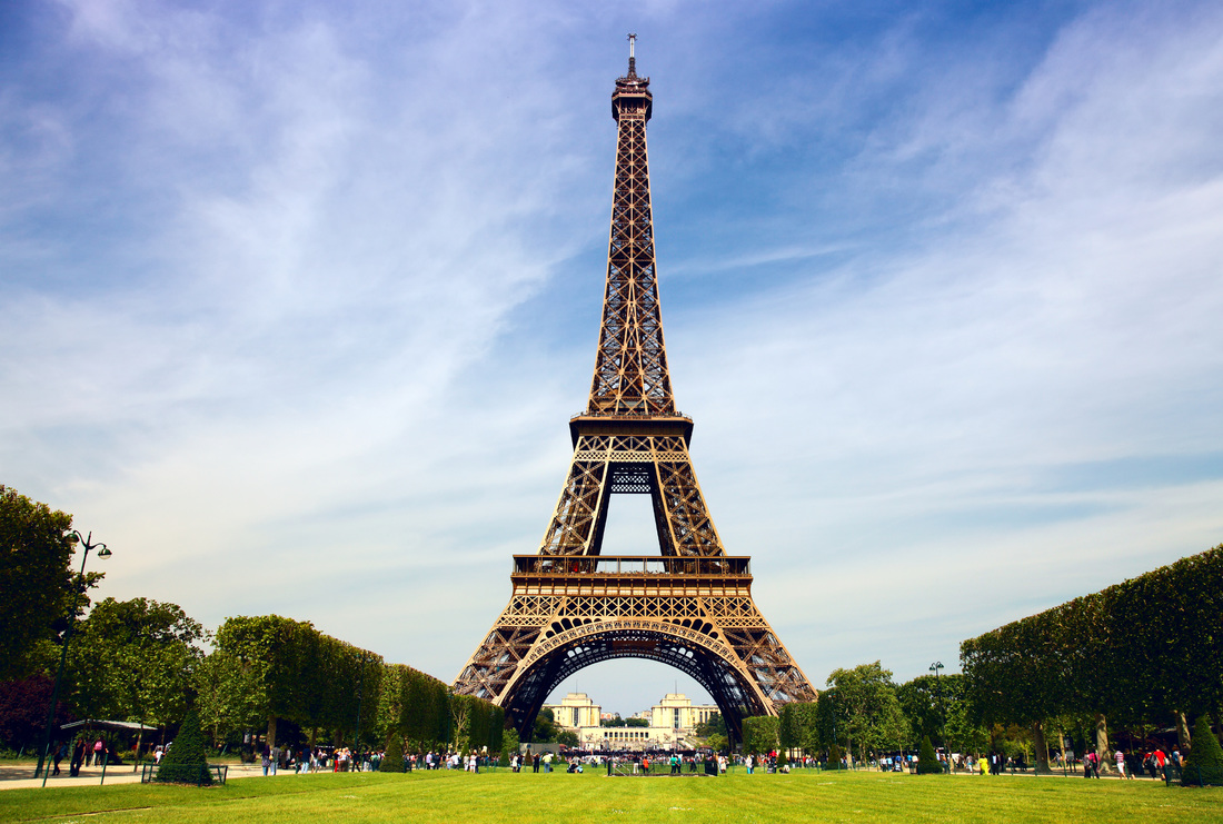
This is an image that I practiced and played around with for my final picture. I took the photo of the legs and thought about blending them with something. Then, I looked on the internet and found a picture of the Eiffel Tower and decided to try blending that with the legs.
|
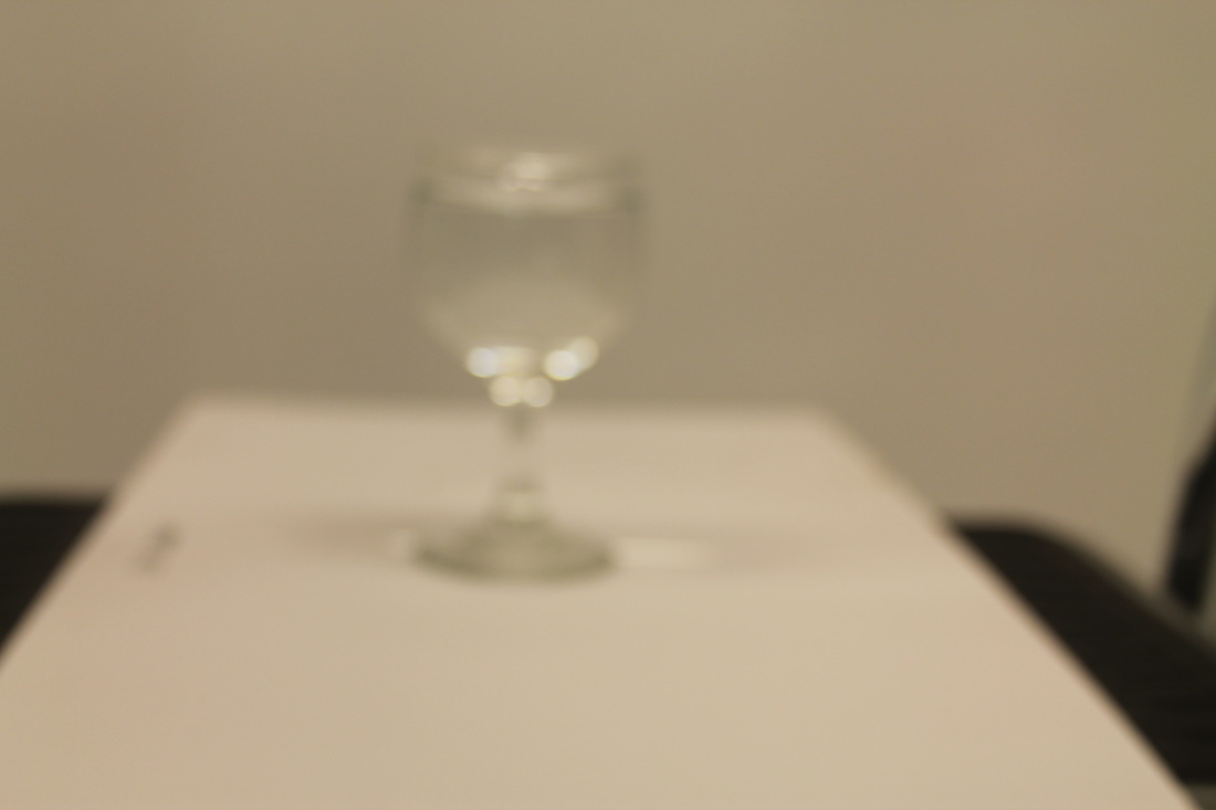
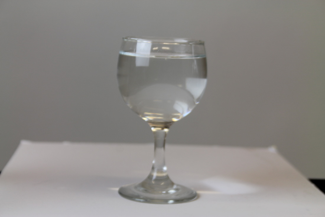
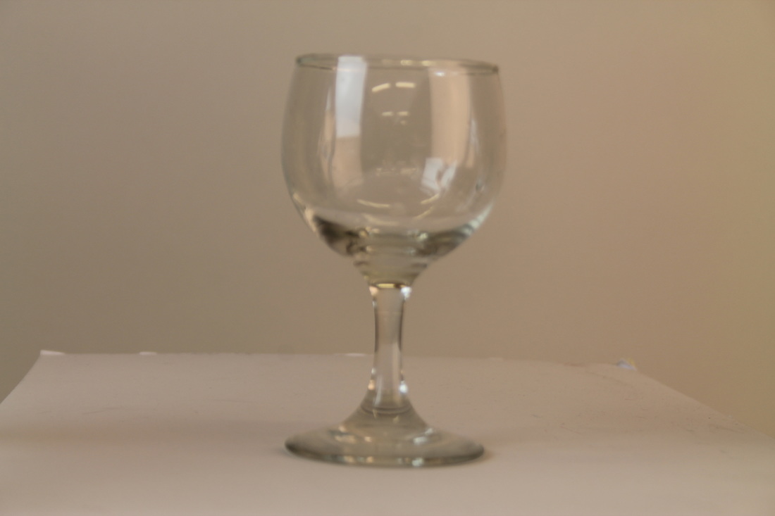
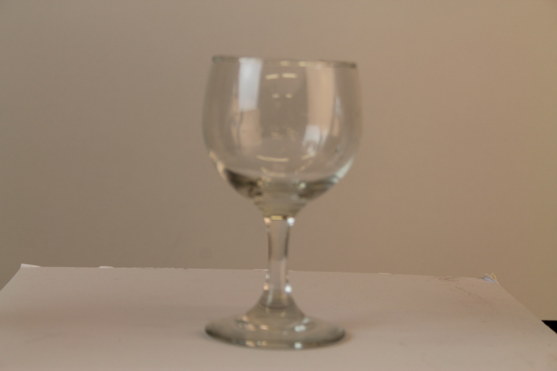
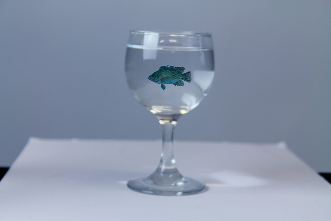
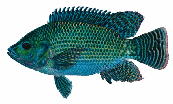
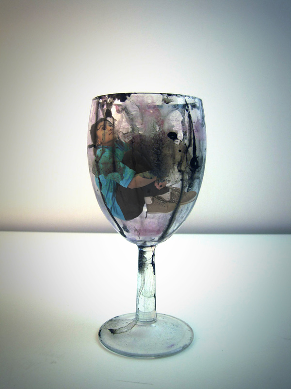
I took a few images of a glass and person looking like they are swimming and decided to put the two pictures together. To make it look more absurd, I decided to add fish to the image as well because you wouldn't find someone swimming with fish in a wine glass. Also, I wanted to make this final image look more imaginative and creative than the other photos. The photo with the fish in the glass wine does look good, but I wanted to find a way to make it look more creative and more absurd.